
Brand Identity / Concept
PawKin
A warm, expressive pet food identity. Explore 19 complete boards, from the animated logo to packaging and retail applications.
View Case Study ↗

A closer look at the brands, storefronts, and creative work I’ve designed. Explore the full identities, the visual systems, and the thinking behind the work.
A warm, expressive pet food identity. Explore 19 complete boards, from the animated logo to packaging and retail applications.
View Case Study ↗
A confident dental identity connecting the clinic, print, and the patient’s phone.
View Case Study ↗
Protein soft serve with an expressive identity built around indulgence.
View Case Study ↗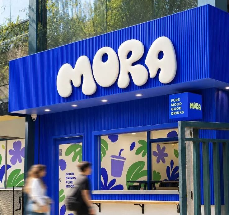
A calming drink brand, from its visual identity to packaging and retail.
View Case Study ↗
Bold typography, warm colours, and a recognizable fast-food packaging system.
View Case Study ↗
A playful matcha lifestyle brand with a consistent logo and packaging system.
View Case Study ↗
A ghost mascot and expressive packaging bring this pizza identity together.
View Case Study ↗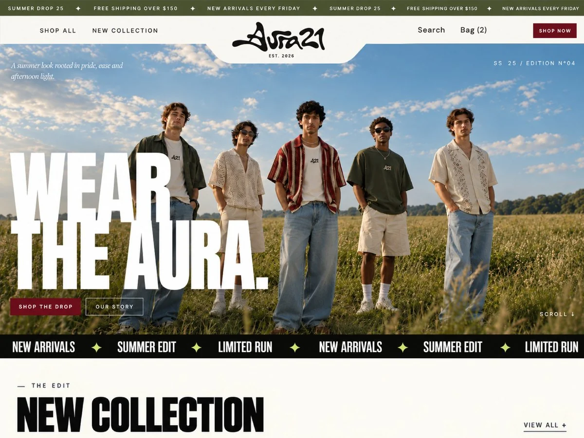
A streetwear storefront shaped around product discovery and a clearer buying journey.
View Project ↗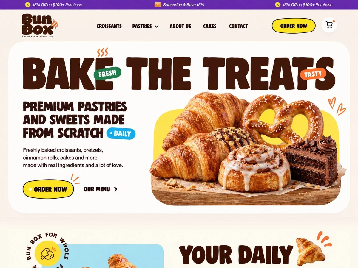
A welcoming bakery storefront that brings the products to the foreground.
View Project ↗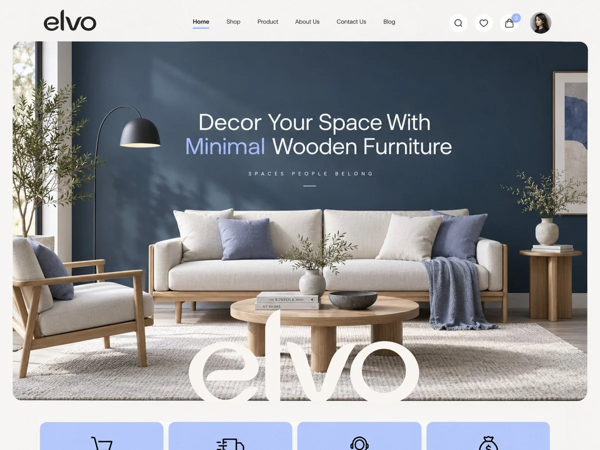
A considered furniture store with a minimal visual direction and clear hierarchy.
View Project ↗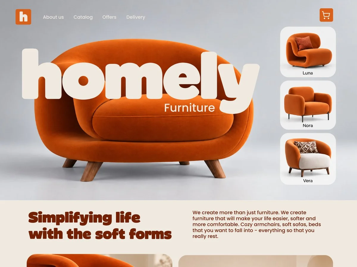
Soft forms and thoughtful product presentation for a warmer furniture brand.
View Project ↗
Branded and direct-response creative variations for ecommerce ad testing.
Explore Creative ↗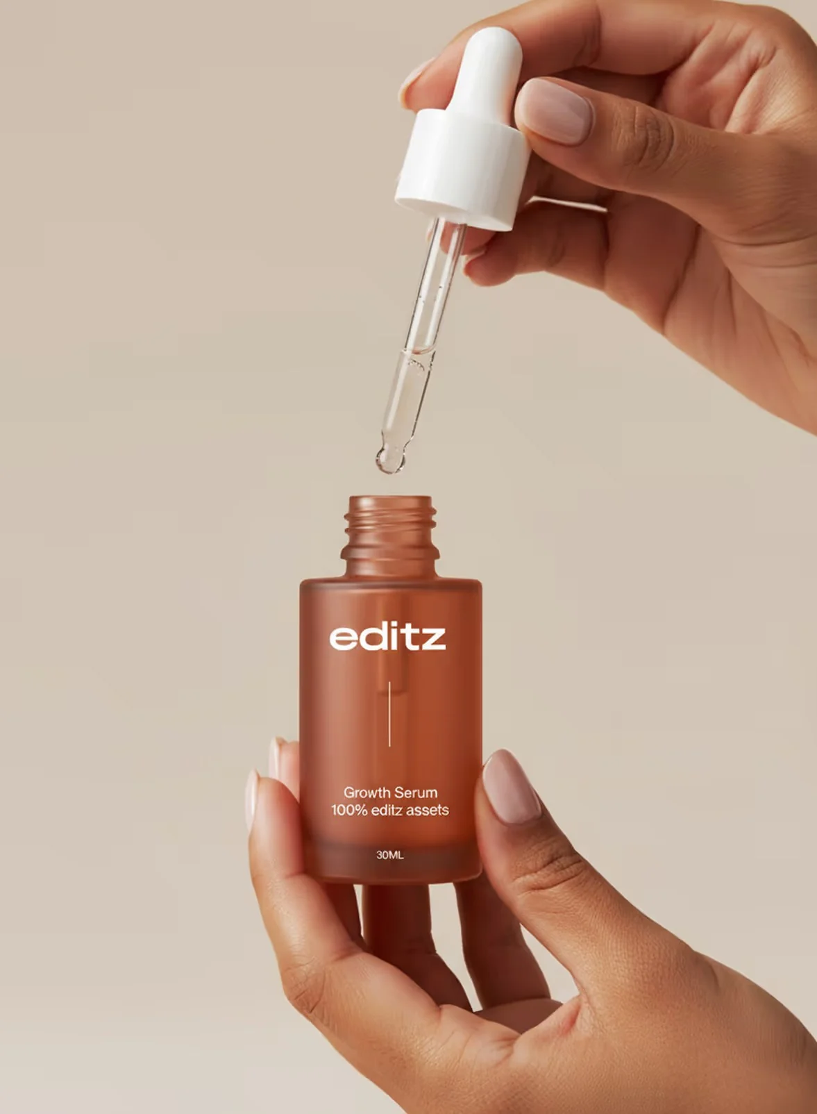
Product-led visual explorations for catalogs, social content, and advertising.
Explore Creative ↗Look at the offer, customer, and context before choosing a creative direction.
Bring brand, creative, and the storefront together around a clear customer decision.
Use organized feedback and a practical review process to guide the next improvement.
Read how I approach ecommerce teardowns, define a focused sprint, and separate the method from measured client results.
The method is the product. This page documents how I read a Shopify store — the full 13-area teardown behind every engagement — with an independent methodology demo on a public storefront.
Honest status first: I don’t have client before-and-after case studies yet, and I’d rather tell you that than invent some. What this page gives you instead is the next best thing: the exact teardown methodology I run on every store, shown working on a real public storefront — labelled as a methodology demo, never as client work. Judge the thinking; the results get published here when they’re real.
A full-journey teardown is a structured review of 13 areas of a Shopify store, from the ad click to checkout — every area explicitly labelled as reviewed with findings, reviewed with no meaningful issue, not accessible, or not assessed, so nothing is silently skipped.
The 13 areas: homepage, navigation, collections, product page messaging, product images and video, pricing and offer, reviews and trust, delivery and returns, variants and purchase controls, mobile experience, cart, accessible checkout, and ads-to-landing- page consistency. The full breakdown — what each of the thirteen reviews covers and what good looks like — is published as the 13-area Shopify conversion framework. Most “audits” check three of these and call it a CRO review. The teardown checks all thirteen and says plainly which ones had nothing wrong — because a clean area is also a finding, and it stops you fixing what isn’t broken.
What it is not: not a template checklist, not a screenshot with red arrows and no priorities, and not a promise of lift percentages. It’s a reading of your store the way a buyer experiences it, ranked by what costs you the most.
Independent methodology demo — not a client engagement. This teardown was run on a public US candle storefront, using only what any visitor can see. No private data, no client relationship, no invented outcomes. It follows the same outcome format every case study on this page will use: problem, research, diagnosis, changes, and measured result — with an explicit “not measured” note wherever nothing was measured.
On the store’s $24 product page, a first-time buyer could see what shipping costs ($7, free over $80 — stated in the announcement bar) but couldn’t tell how long the candle would take to arrive: there was no delivery-time estimate anywhere near Add to Cart. Arrival timing is the question that stops a first order, and the page didn’t answer it.
A 13-area review of the page, using only visitor-visible data. Area status: delivery and returns — reviewed with findings; variants and purchase controls — reviewed with findings; product page messaging — reviewed with findings; reviews and trust — reviewed with no meaningful issue (ratings were present and visible; the gap was guarantee placement, not missing proof); the remaining nine areas — not assessed (single-page demo scope, not a full engagement).
The store states the cost and skips the timing — and timing is what a first-time buyer is actually weighing. Placement compounds it: no stock indicator and no money-back guarantee appear near the button, the one place the buyer is deciding.
None implemented. This was an independent demo, not a client engagement — I don’t touch stores I don’t work with.
Not measured. With no engagement and no access to the store’s analytics, there is no conversion lift to report — and I won’t invent one. The output of a methodology demo is the ranked finding list above: the thinking you can judge, not a result you can’t verify.
$750, fixed price. The Shopify Conversion Fix Sprint is the teardown plus the fix: the 13-area review, then the highest-impact findings implemented in your store within seven days of kickoff.
Want only the diagnosis? The ecommerce UX audit is the teardown as a report — no implementation. Same thirteen areas, same honest labelling.
This page is the proof shelf: the methodology and the demos. The engagements it supports: Shopify CRO consulting is the Conversion Fix Sprint itself — teardown plus implementation, $750, seven days. The ecommerce UX audit is the teardown as a report, no implementation. Ecommerce growth consulting is ongoing ownership of the whole line, ads to repeat purchase. And landing page optimization is the single-page version — the destination your paid traffic hits, rebuilt against your live ads. If the question is “show me how you think,” you’re on the right page.
Not yet — and I won’t invent them. This page documents my teardown methodology and independent methodology demos run on public storefronts, so you can judge the quality of the thinking before any engagement. Client before-and-after results will be published here only when they are real and the client agrees.
A structured review of 13 areas of a Shopify store, from the ad click to checkout: homepage, navigation, collections, product page messaging, product images and video, pricing and offer, reviews and trust, delivery and returns, variants and purchase controls, mobile experience, cart, accessible checkout, and ads-to-landing-page consistency. Every area is explicitly labelled — reviewed with findings, reviewed with no meaningful issue, not accessible, or not assessed — so nothing is silently skipped.
On a public US candle storefront’s $24 product page, the buy box showed the shipping cost in the announcement bar but no delivery-time estimate near Add to Cart — a first-time buyer couldn’t tell how long the candle takes to arrive. No stock indicator and no money-back guarantee appeared near the button either. The cost is stated; the timing the buyer actually needs is missing.
It means exactly what it says. Every case study on this page is structured as problem, research, diagnosis, changes, and measured result. Where no client engagement exists — independent methodology demos — there is no conversion lift to report, so the result is labelled not measured instead of being invented. Client before-and-after results will carry real numbers here only when they are real and the client agrees.
The teardown is the diagnosis: the 13-area review with every finding documented and ranked. The Shopify Conversion Fix Sprint is the teardown plus the fix — the highest-impact findings implemented in your store within seven days, $750 fixed. If you only want the diagnosis as a report, the ecommerce UX audit is the report-only version.
Yes. Book a fit call and I’ll tell you honestly whether a teardown is the right starting point for your store — and whether the sprint, the UX audit, or one of the single-page engagements fits better. If your store isn’t the problem, I’ll say so.
Because the method is the product. Independent reviews of public storefronts use no private data and are always labelled as methodology demos, never as client work. They let you see exactly how I read a store before you trust me with yours — and you can see the builds behind that lens in my portfolio.
Book a fit call. Tell me where your store stands — I’ll tell you honestly whether the teardown is the right starting point. If it isn’t, I’ll say so.
A new identity, a better store, or a clearer path to checkout. Tell me where you want to go.
Discuss Your Project ↗


