Good food.
Happy family.
A warm, expressive identity for a pet food brand that sees cats and dogs as part of the family.
- Project type
- Concept brand identity
- Sector
- Pet food & care
- Scope
- Identity, packaging & art direction
- Presentation
- 19 original boards
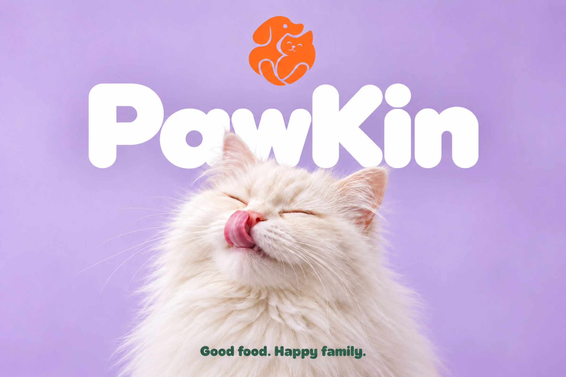
A little care.
A lot of character.
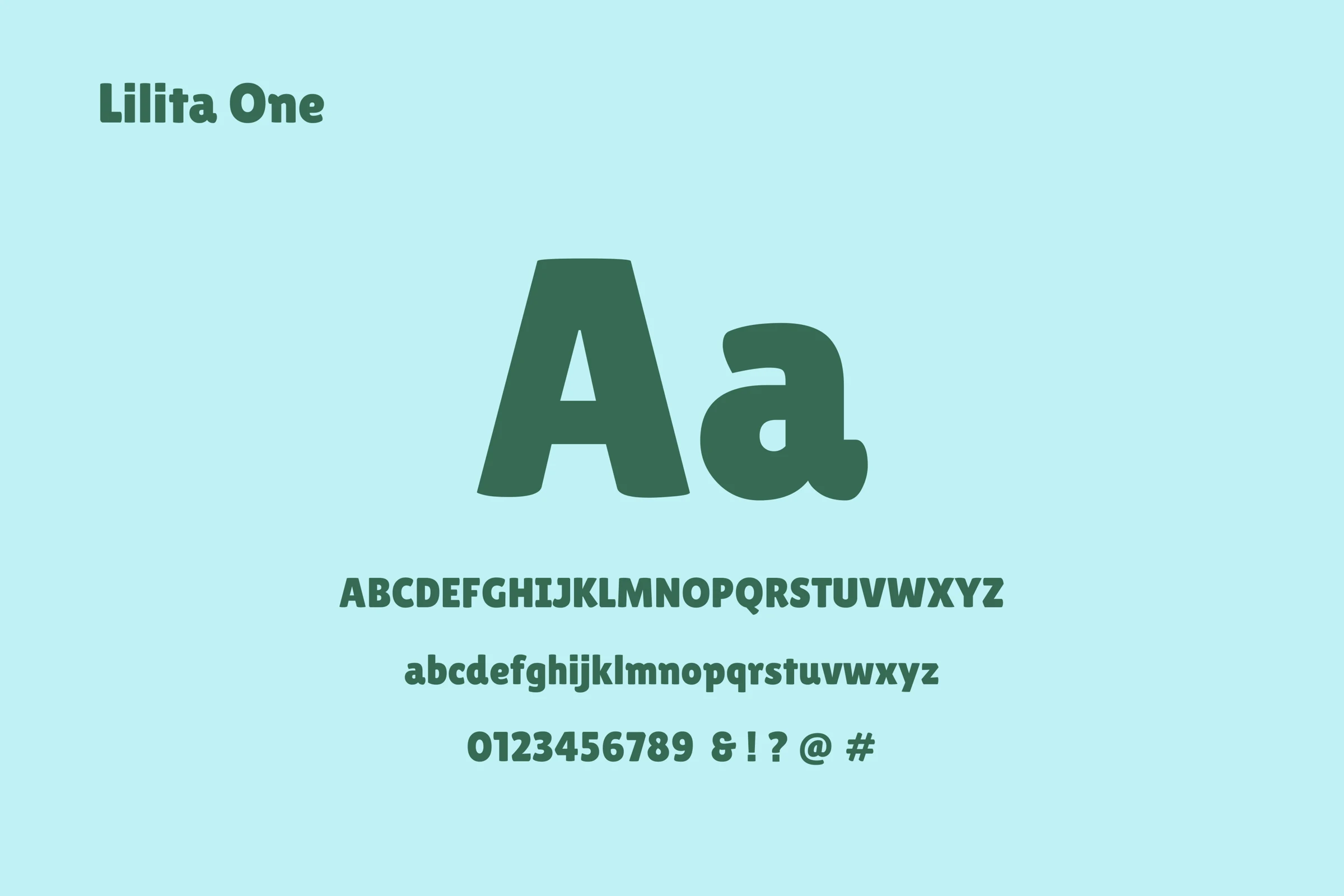
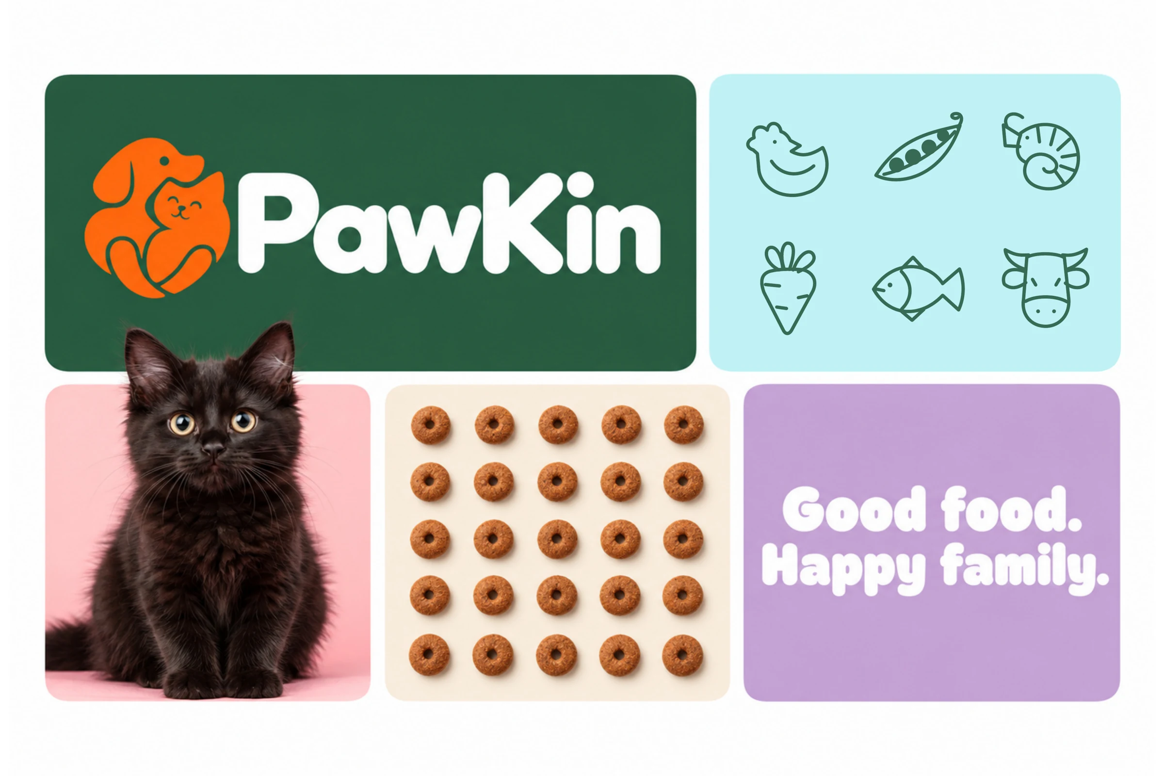
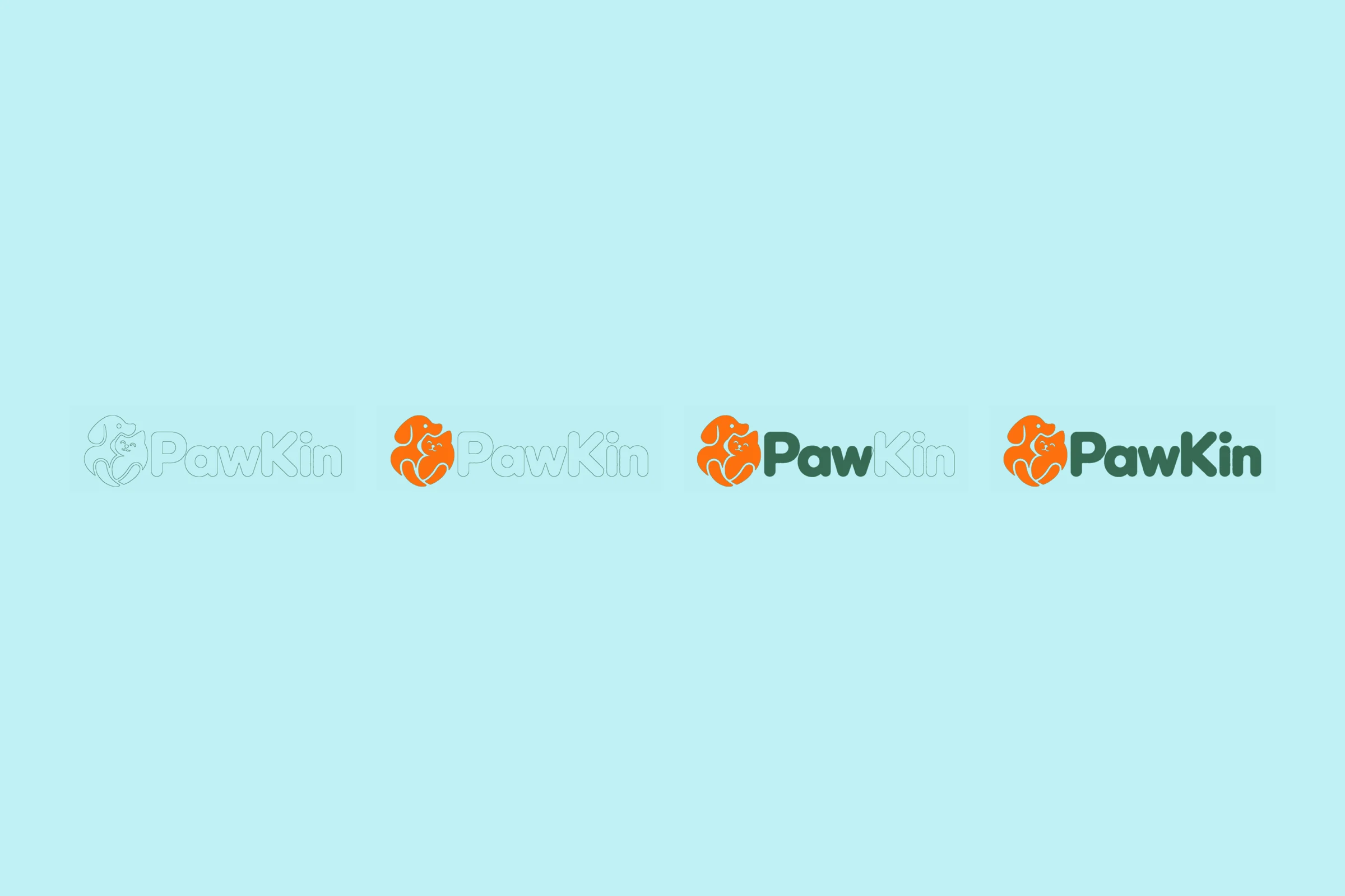
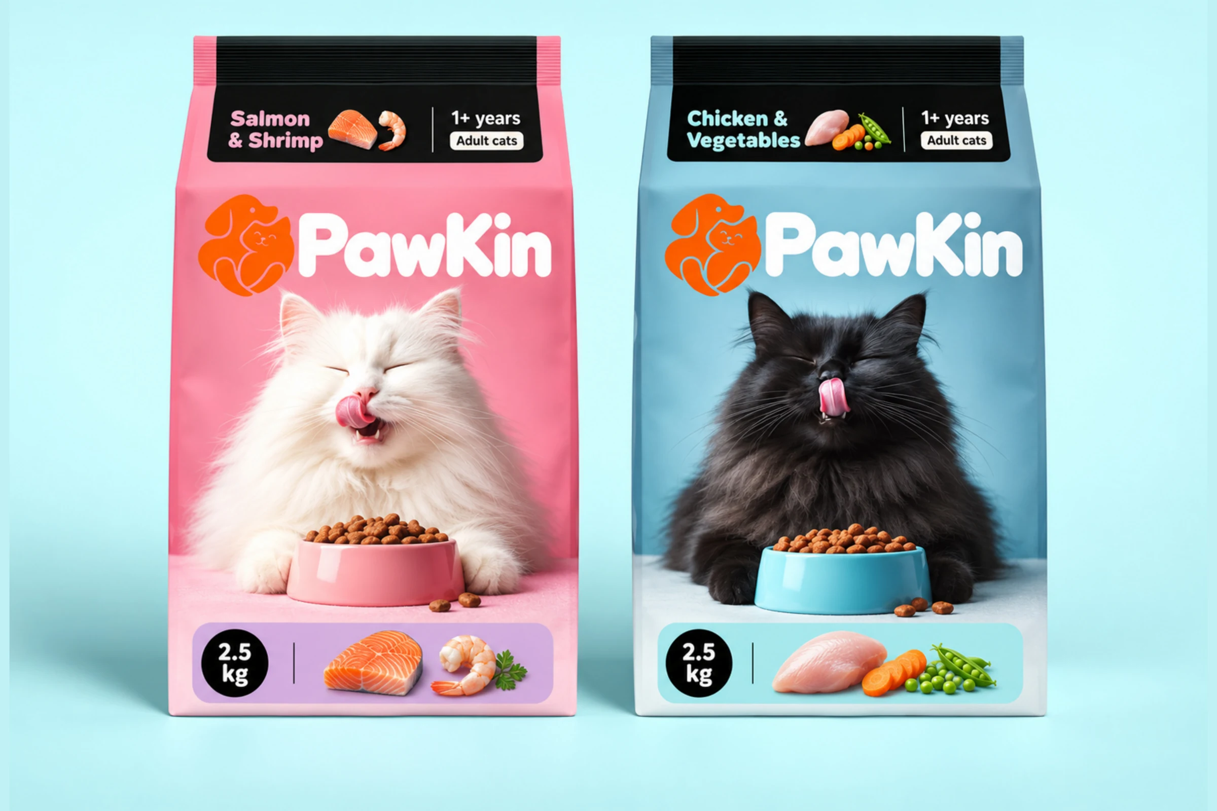
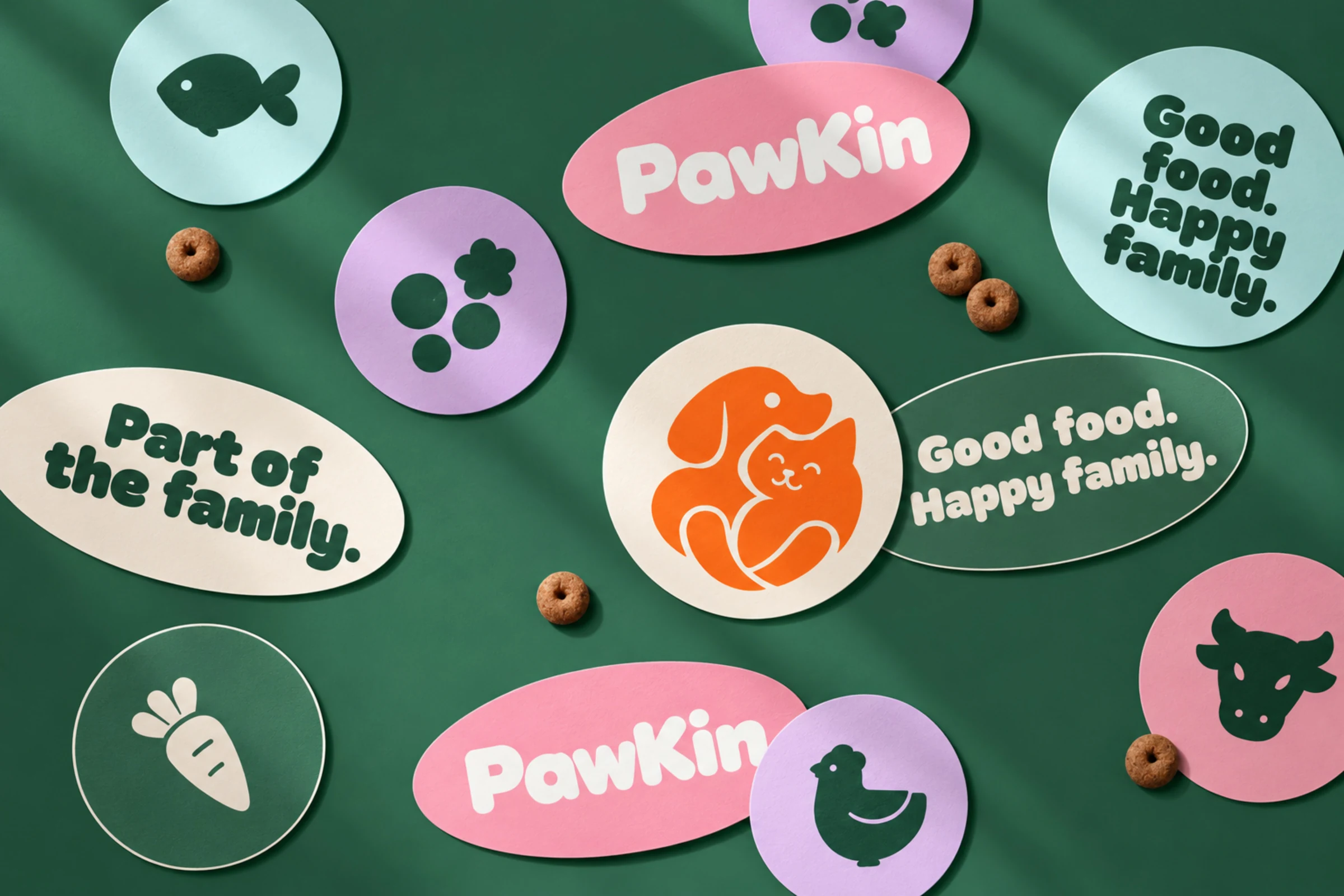
The PawKin presentation brings together a dog-and-cat symbol, a rounded wordmark and a colour system of deep green, aqua, pink, lilac and a bright orange accent.
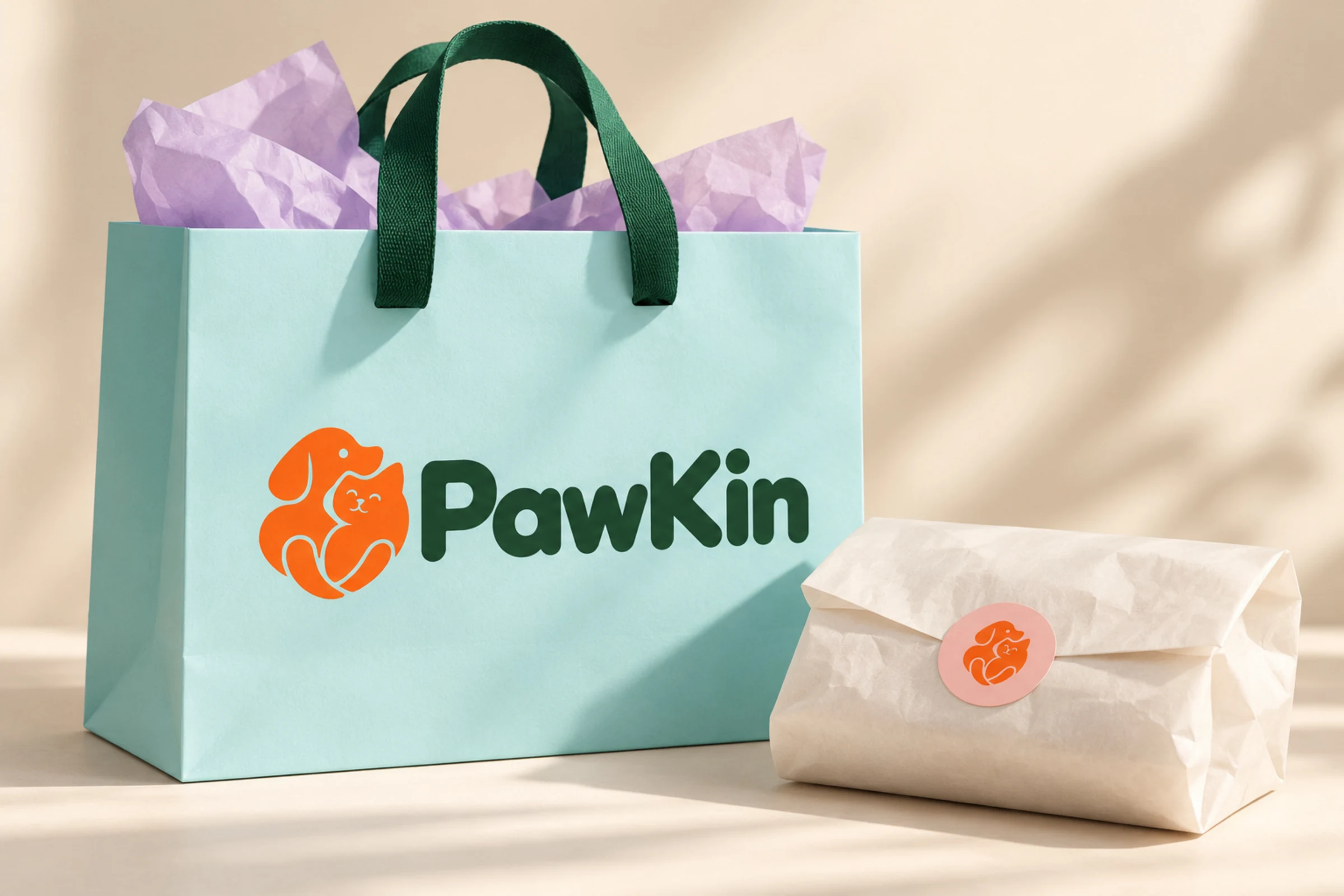
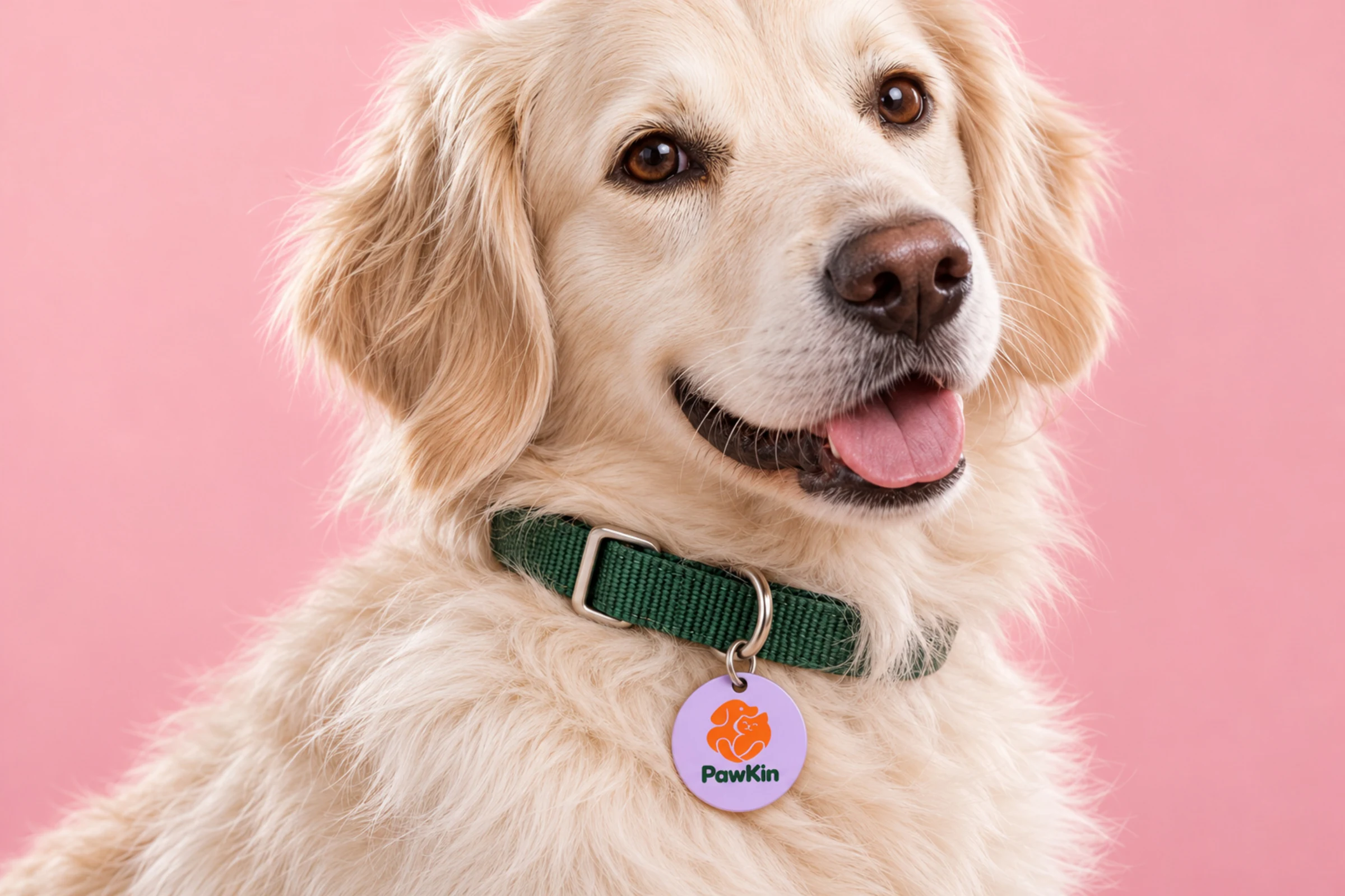
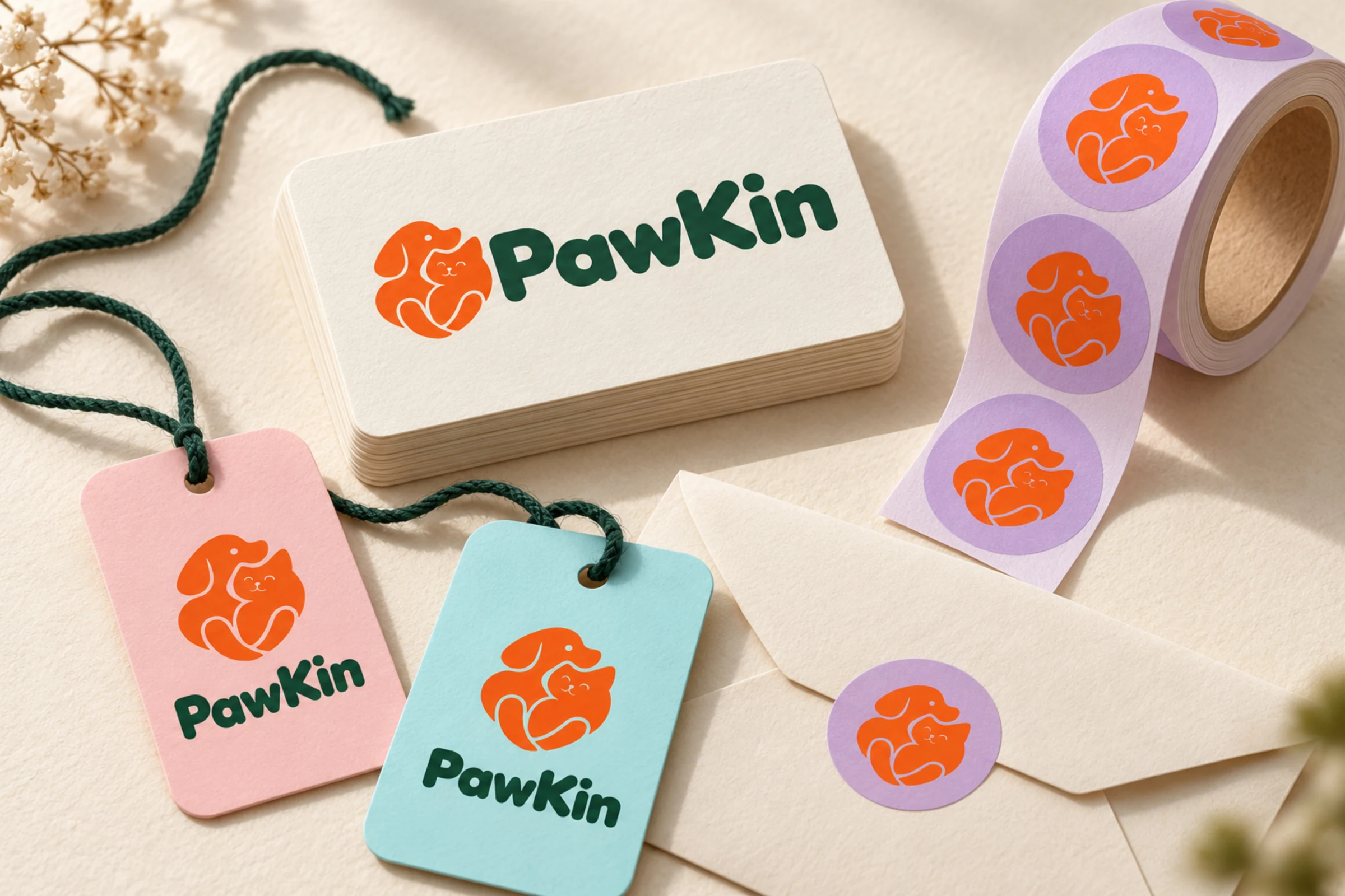
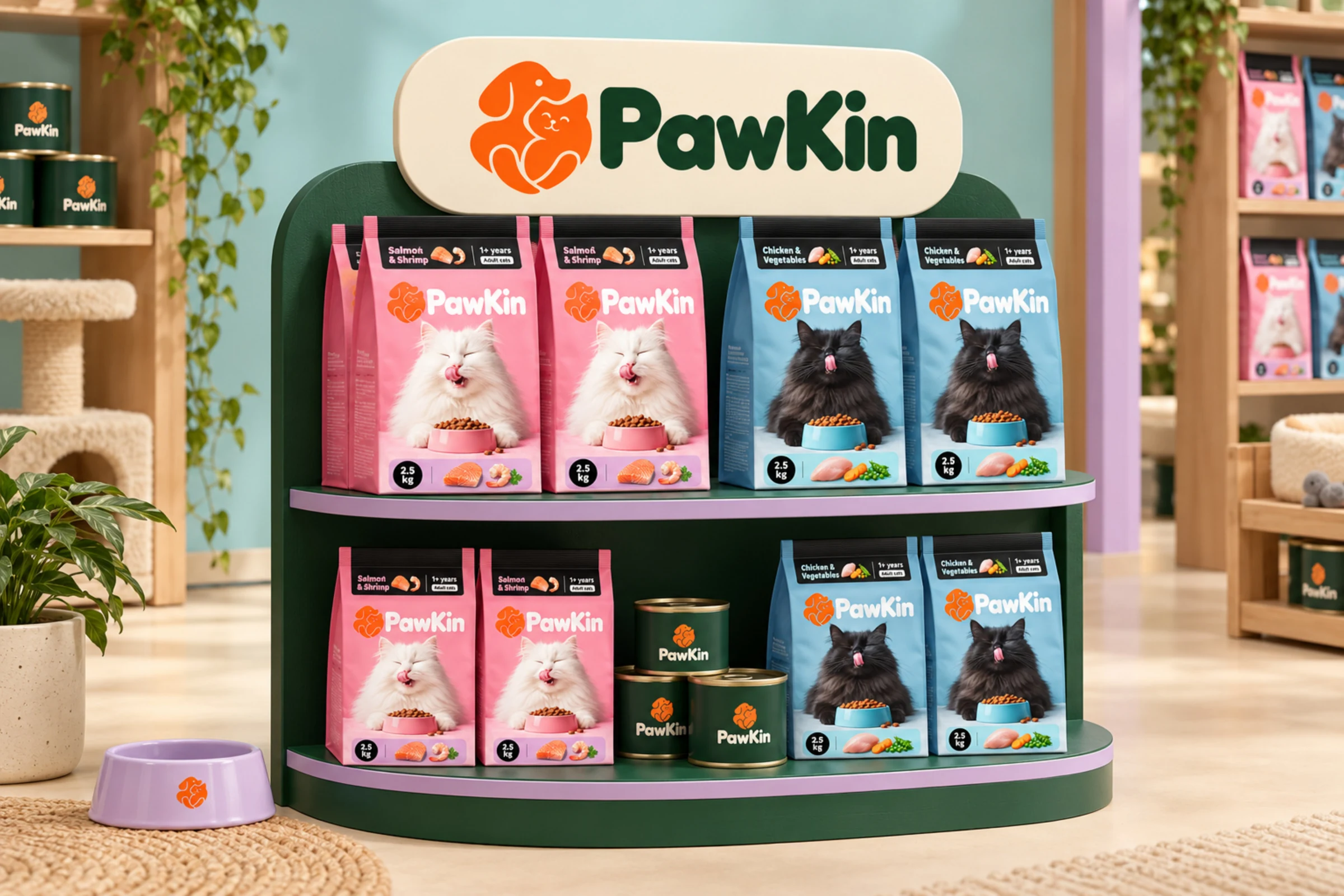
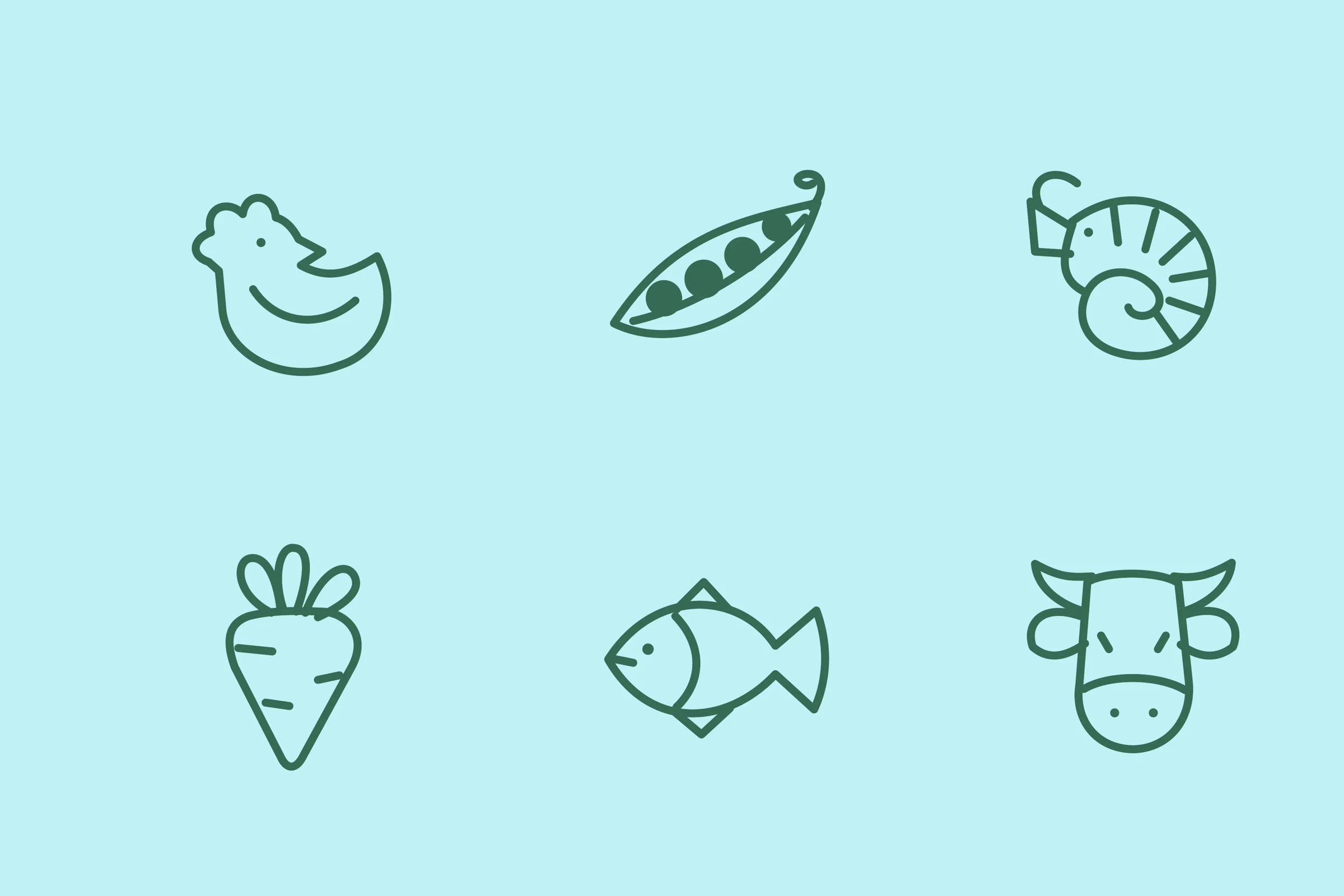
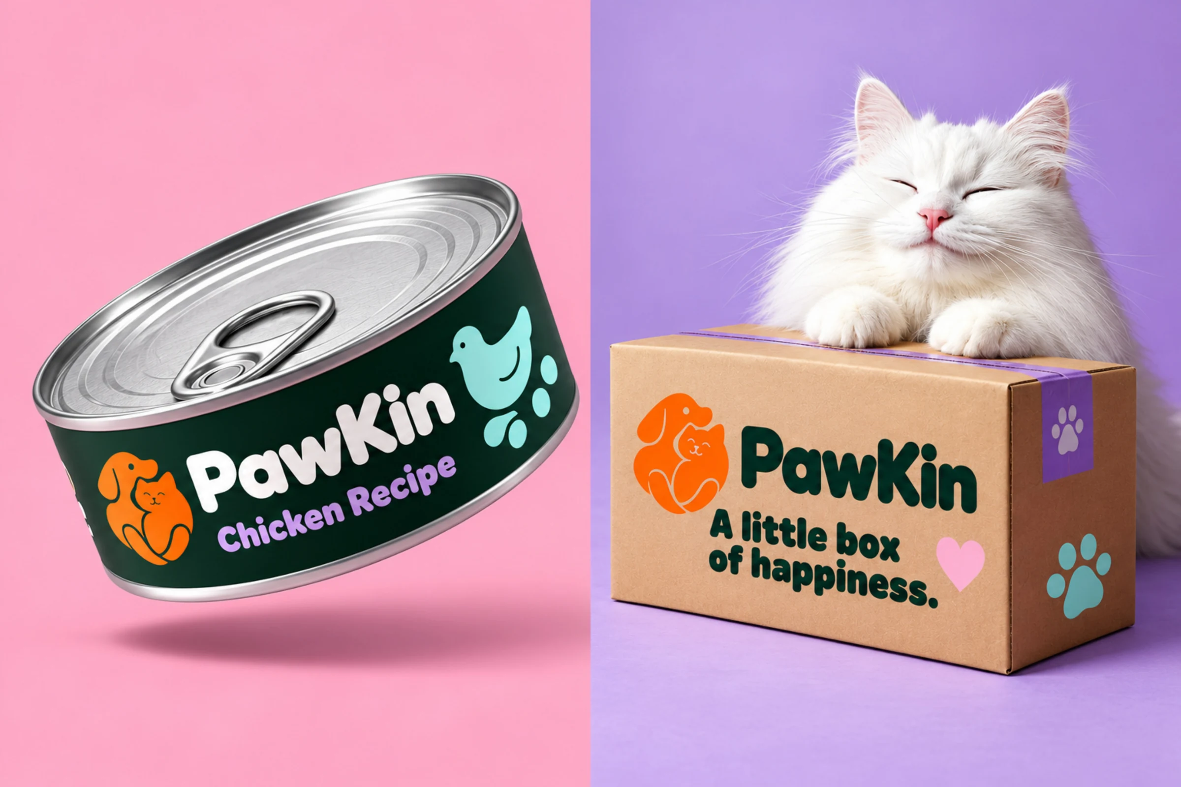
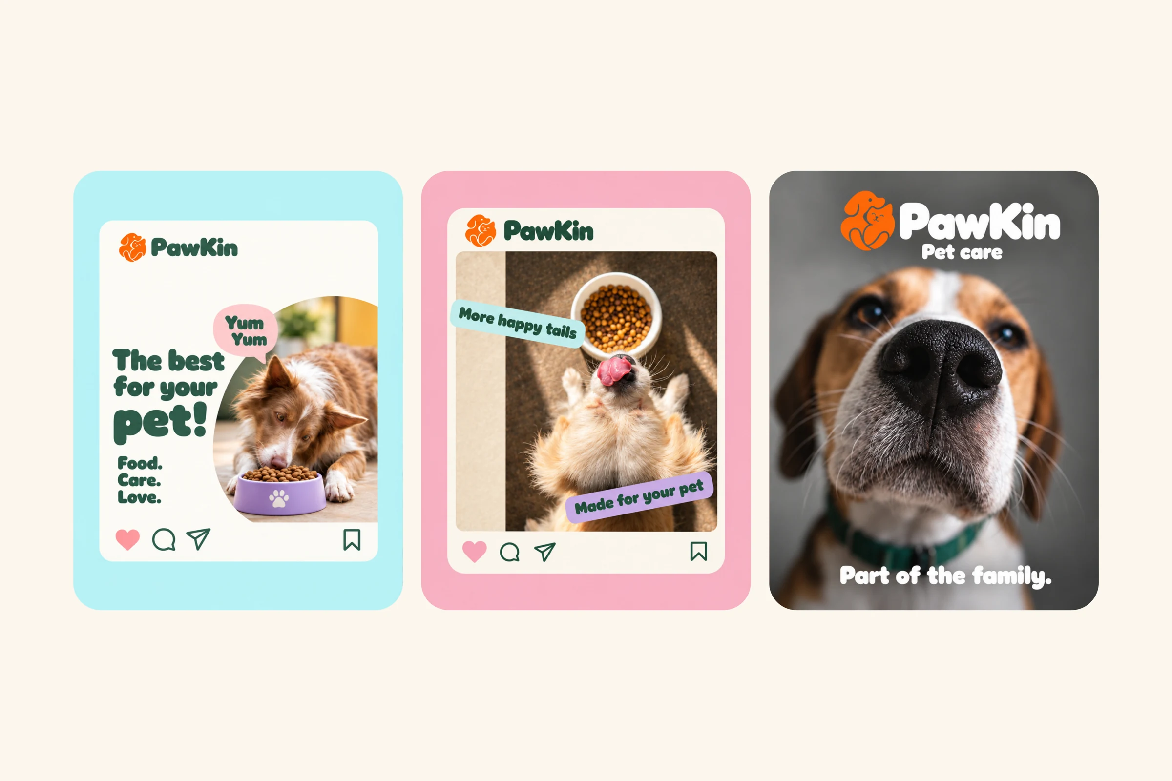
The identity extends from ingredient illustrations and food packaging to social campaigns, delivery materials, stationery and retail displays. Each touchpoint carries the same friendly, family-focused voice.
This is a concept identity presentation, not a published client performance case study. No sales or campaign results are claimed.
Built to feel like family.
The symbol, typography, colours and illustration language form one recognizable system.

From the shelf to the feed.
Food pouches, cans and campaign compositions place the product and its personality together.

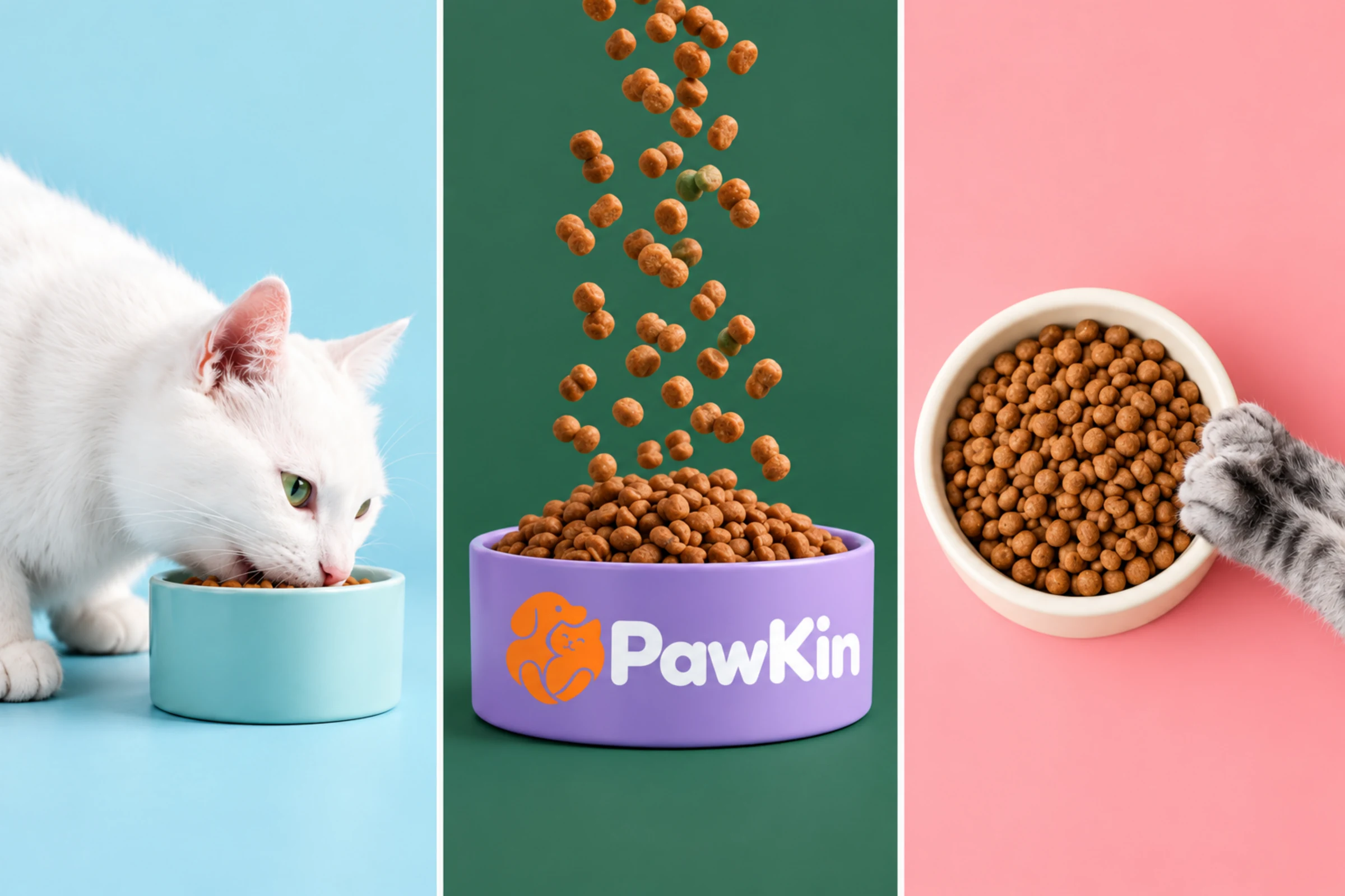
One identity. Every touchpoint.
Shopping bags, identity tags, stationery and retail displays carry the visual language into everyday moments.