

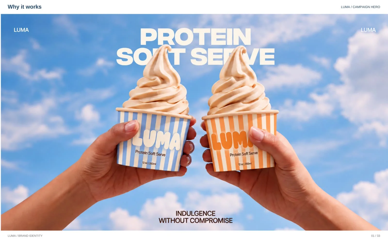
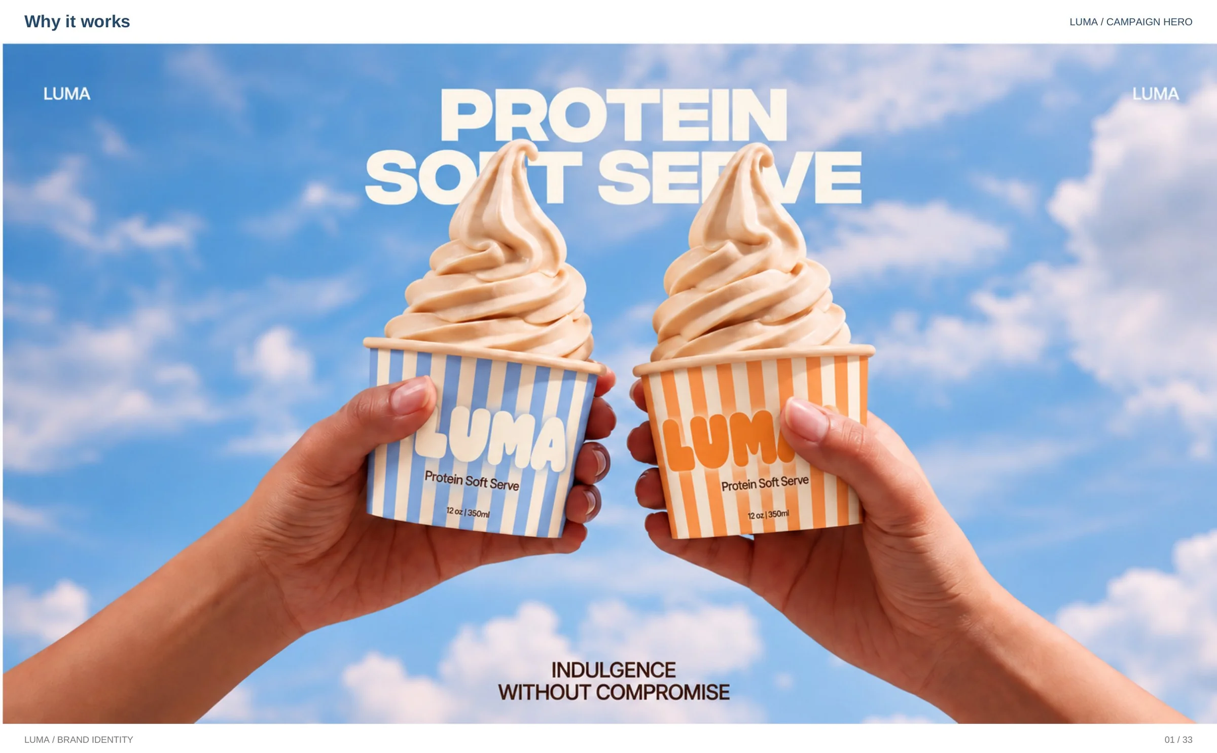
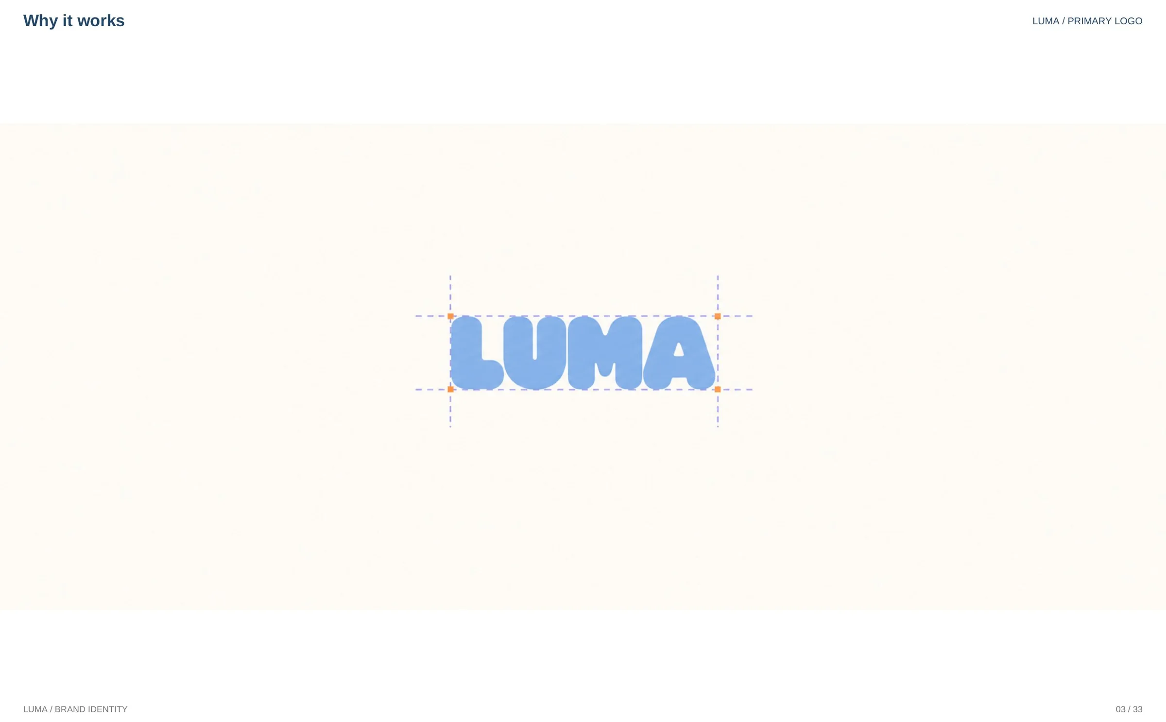
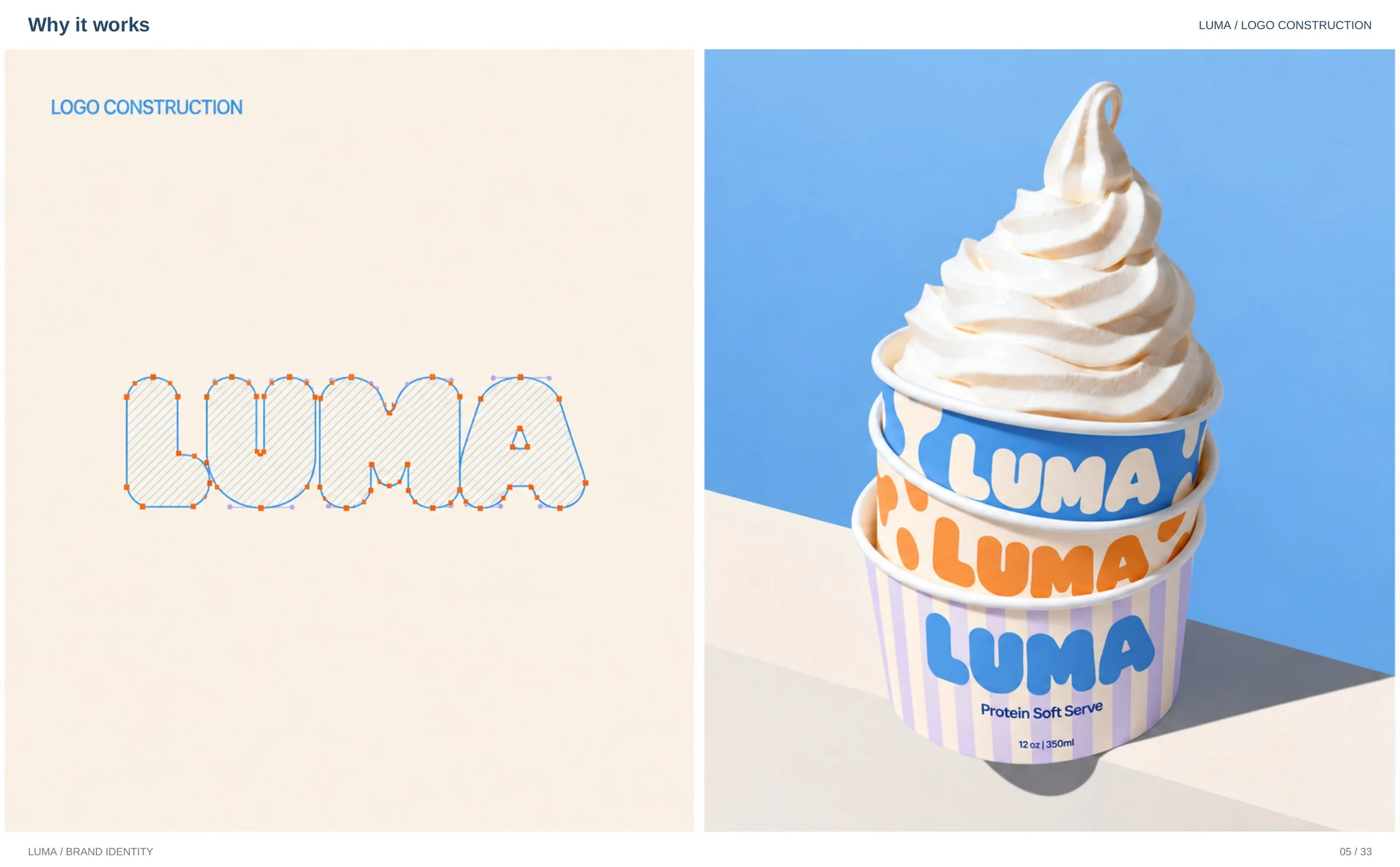
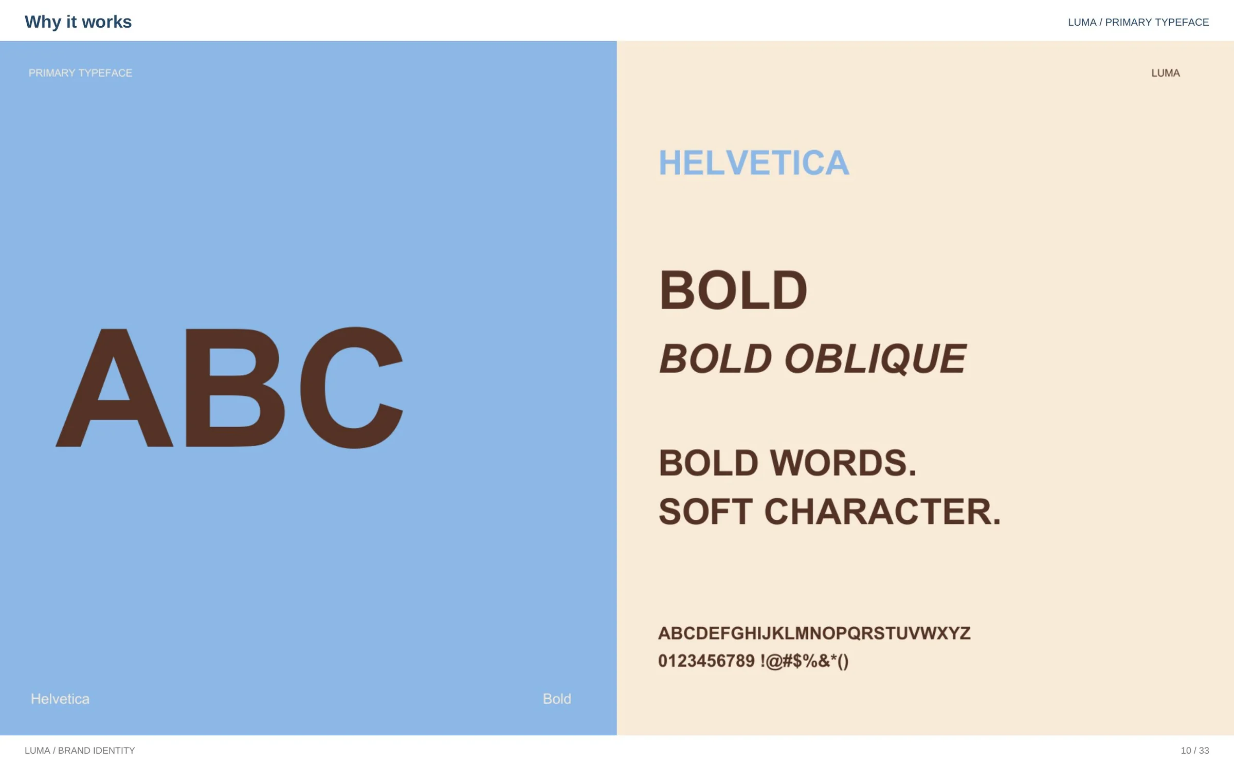
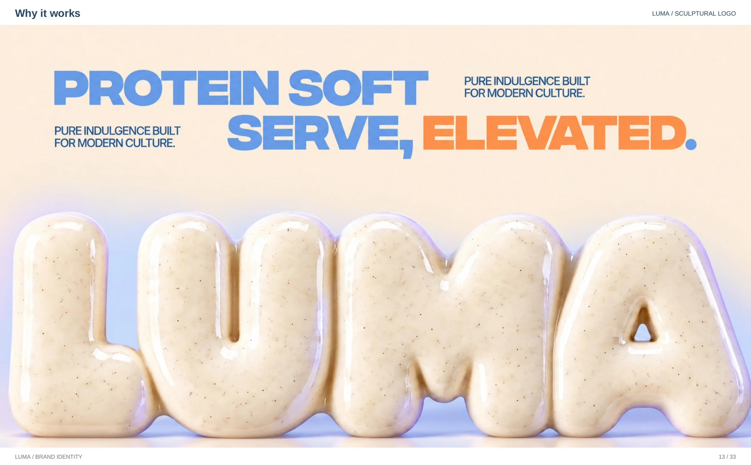
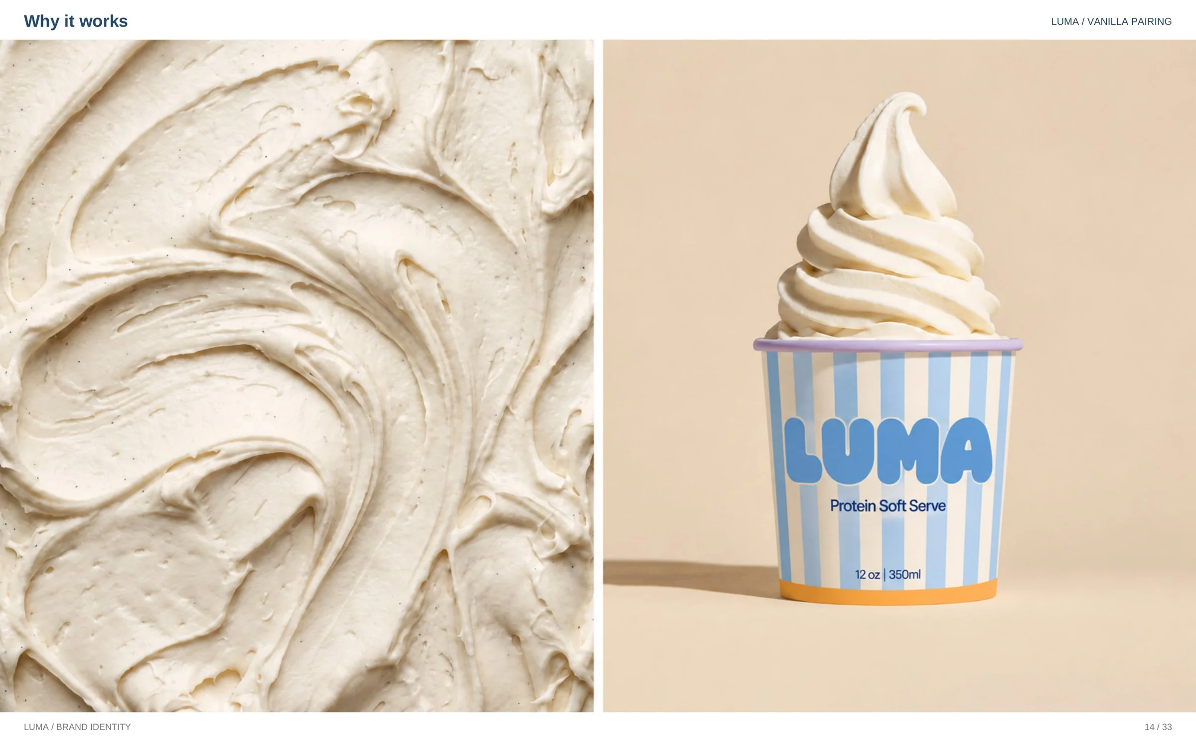
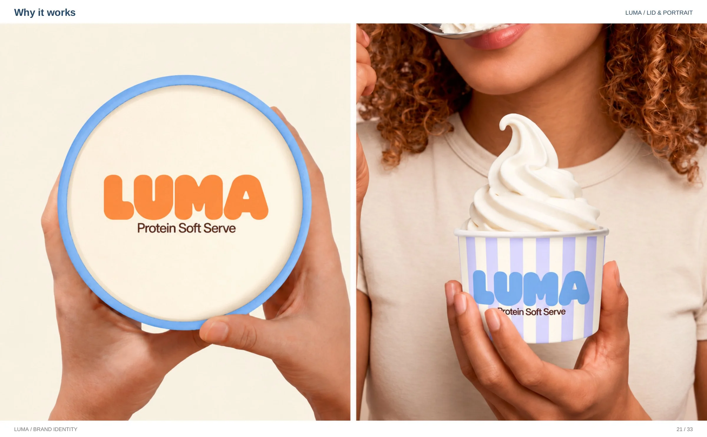
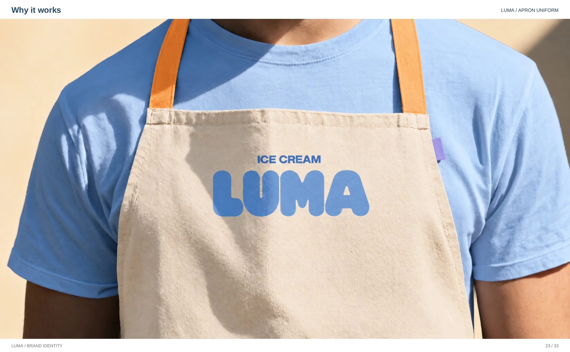
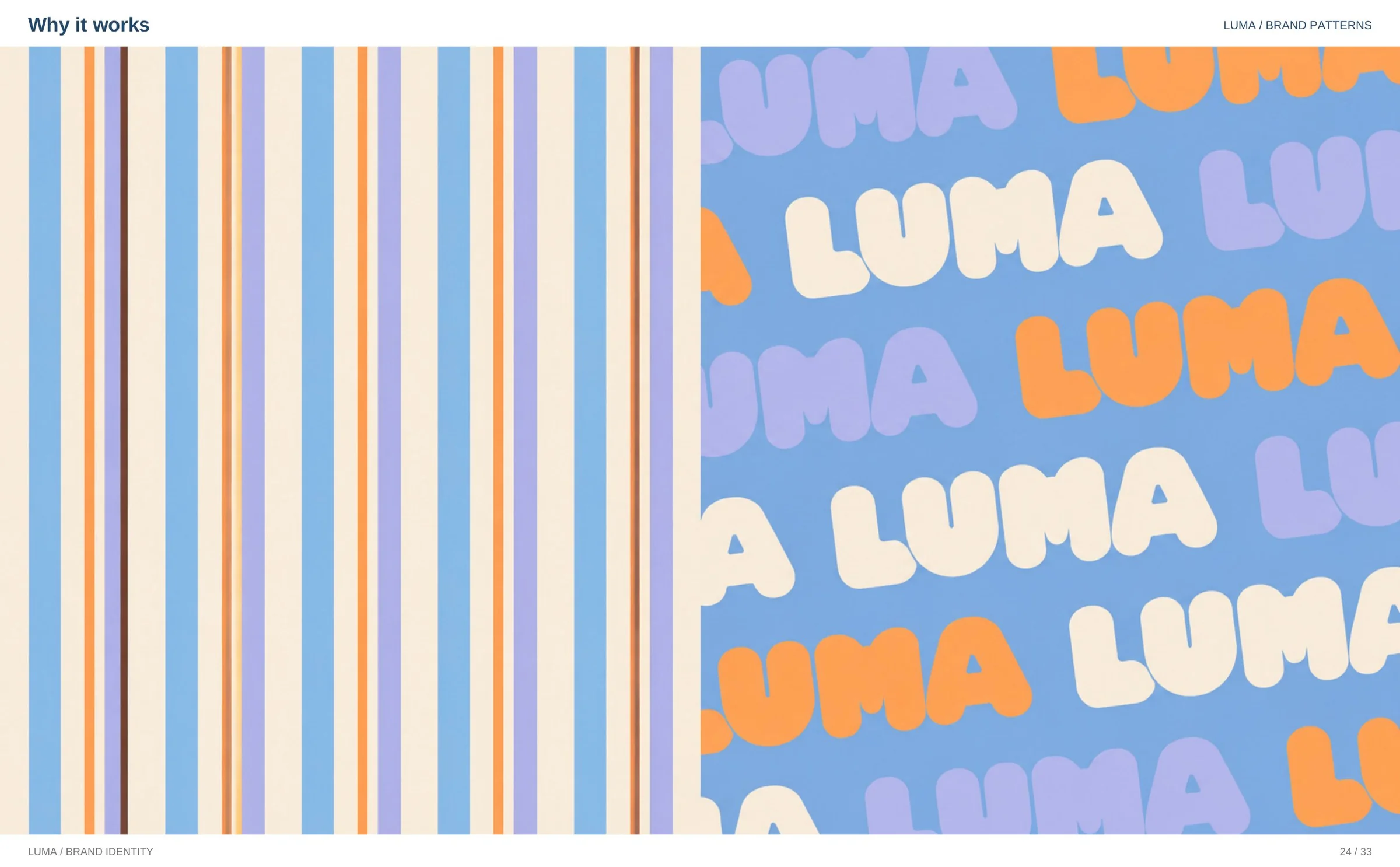
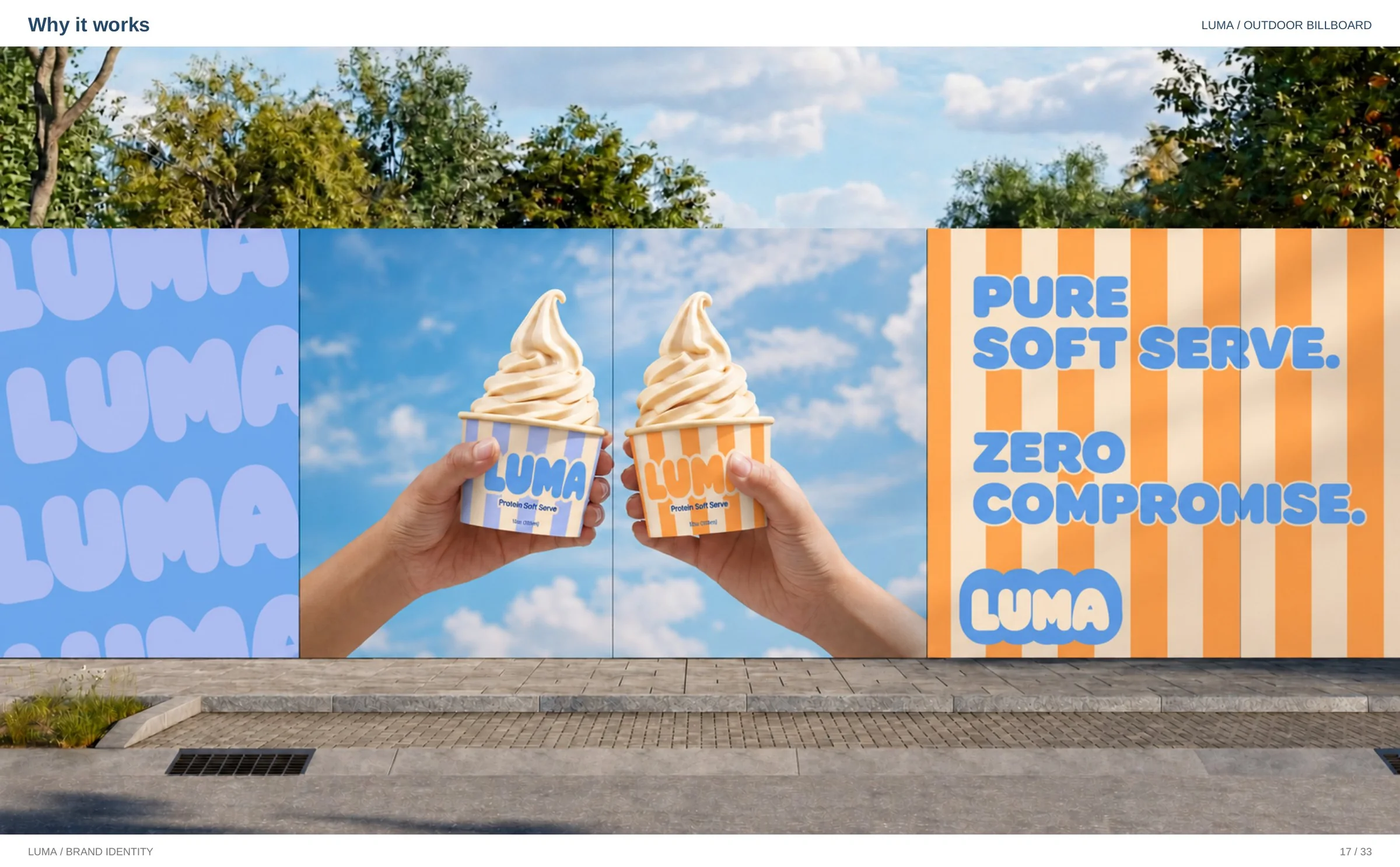
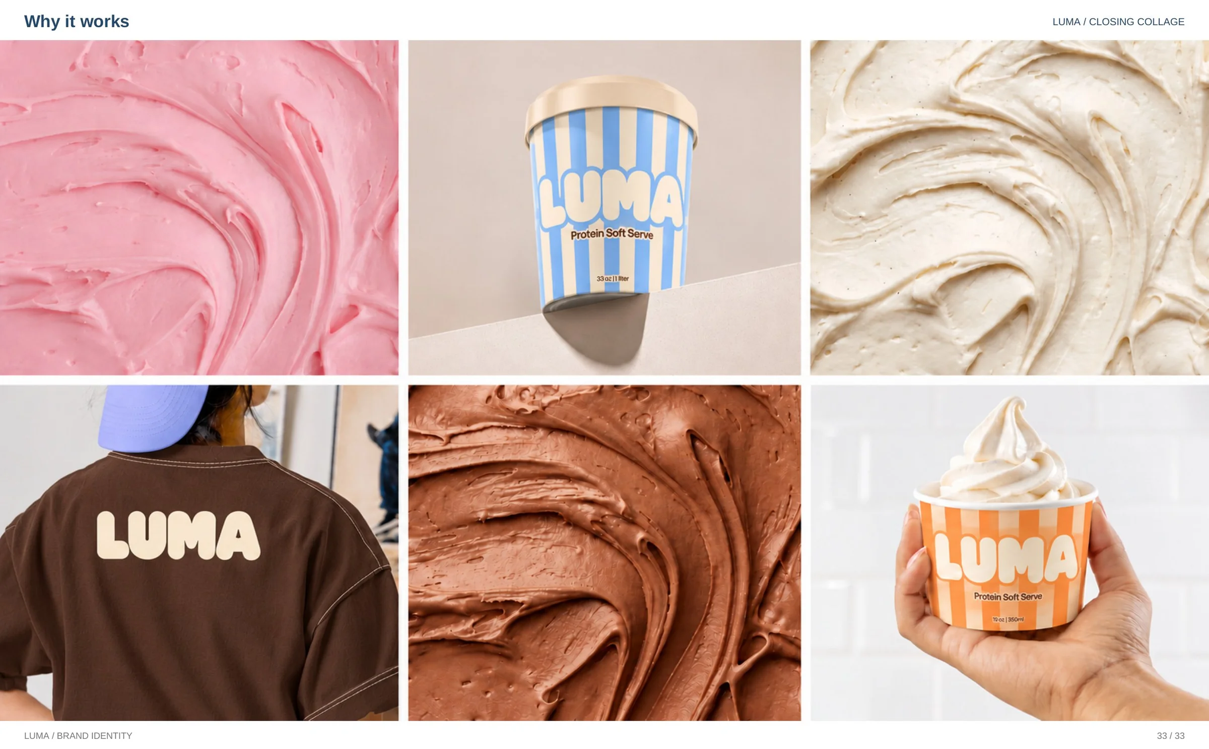
Most protein products apologise for existing. Luma does the opposite. Luma is a protein soft serve brand, and this is the full identity built for it at whyitworks: logo, colour, typography, packaging, signage and campaigns.
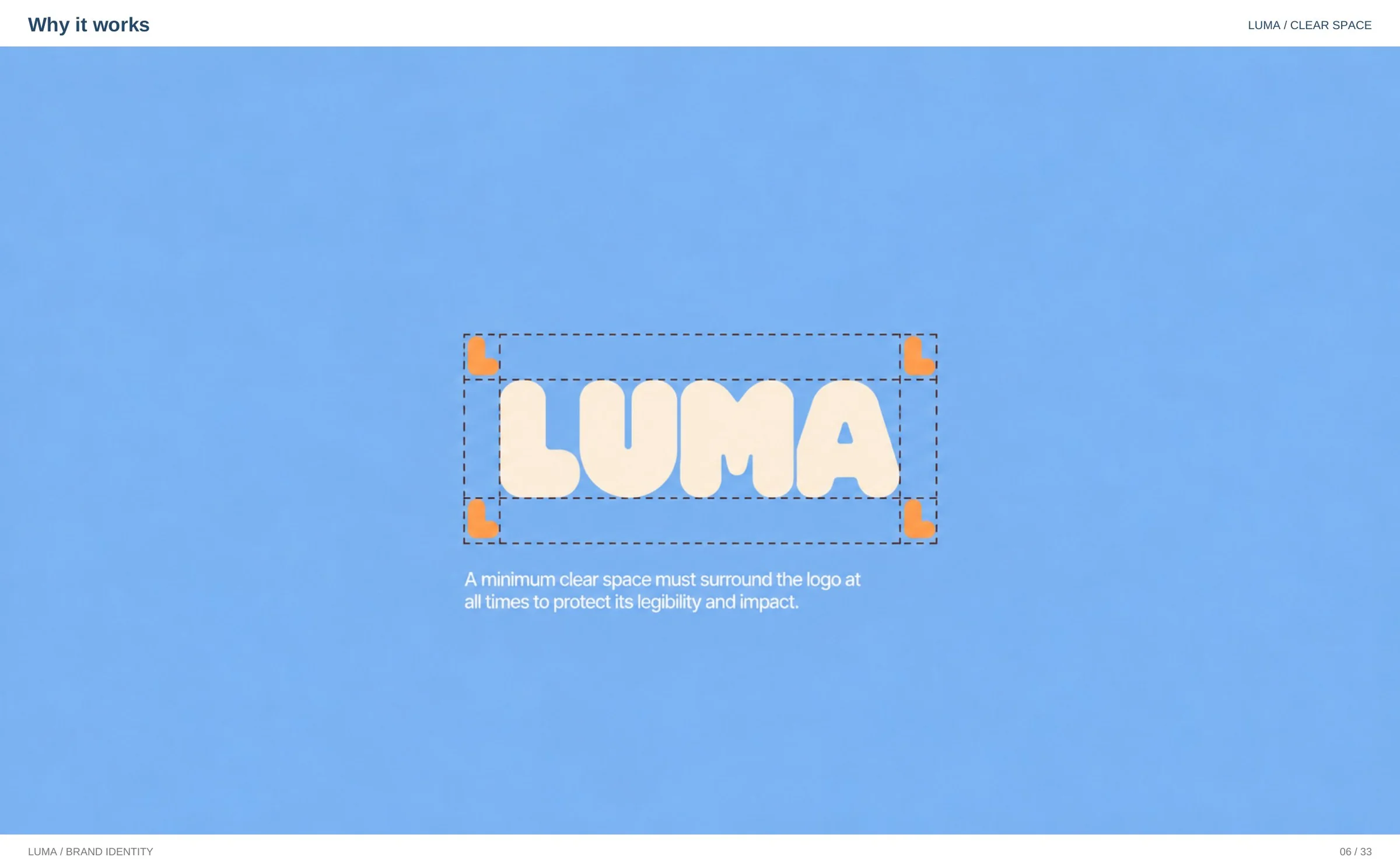
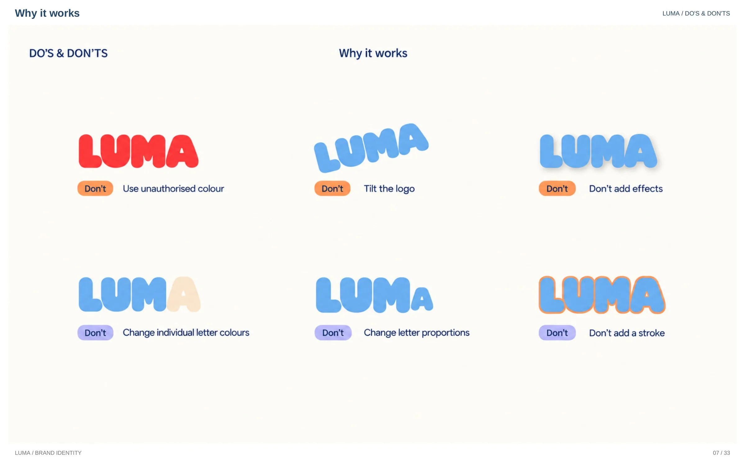
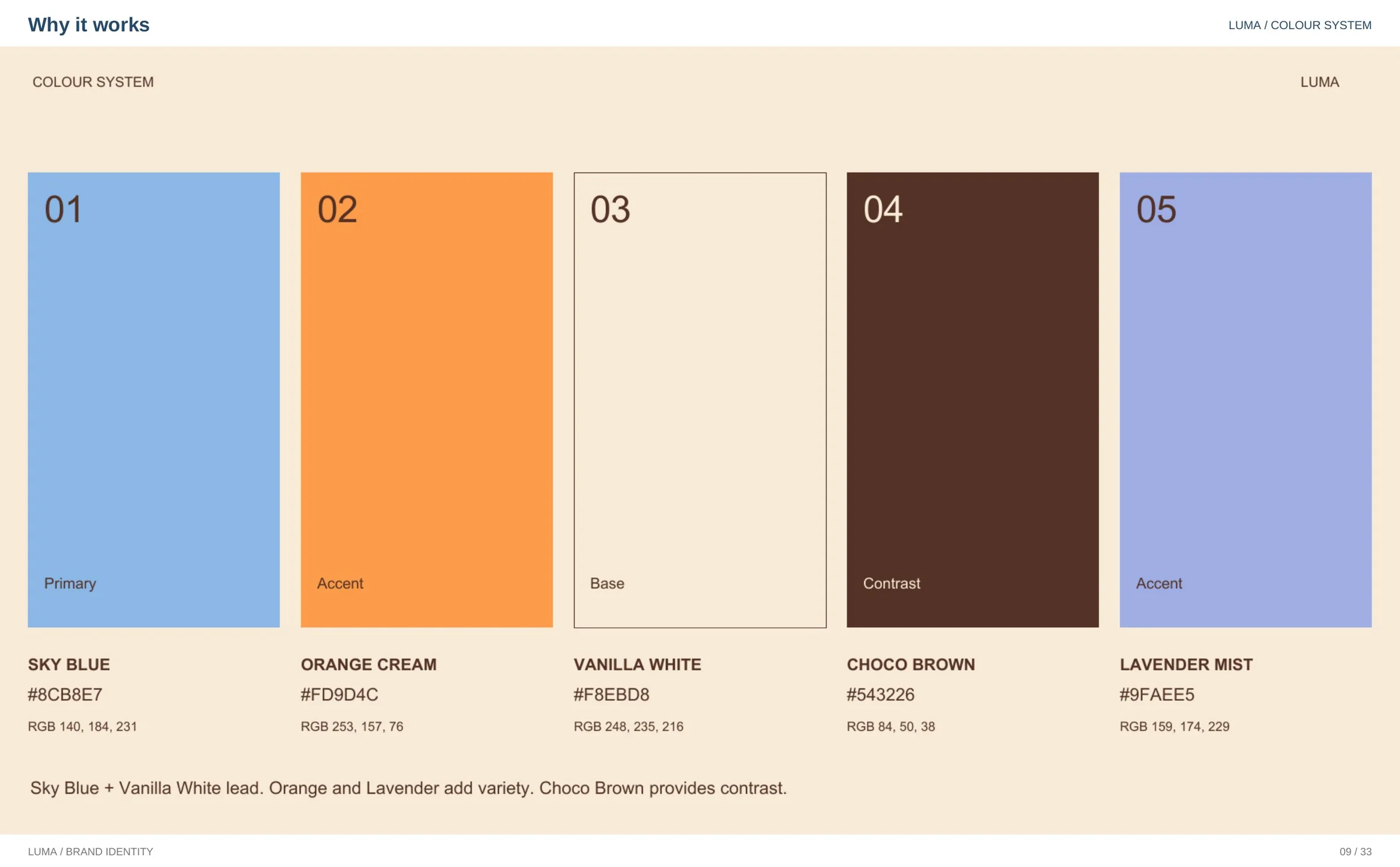
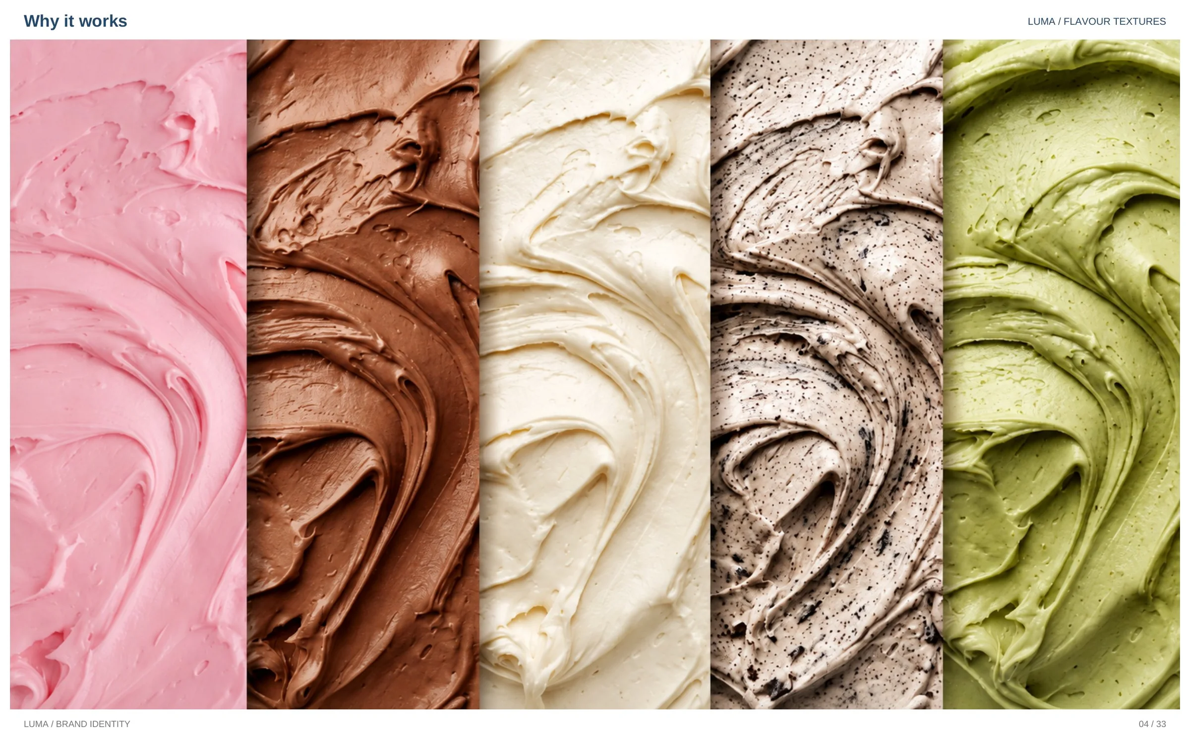
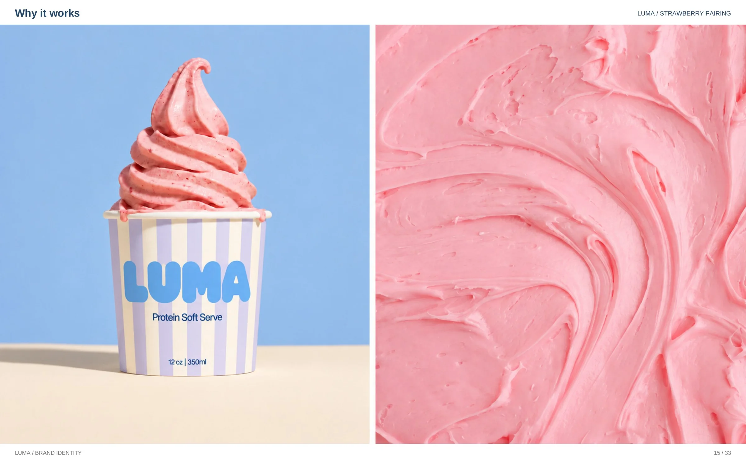
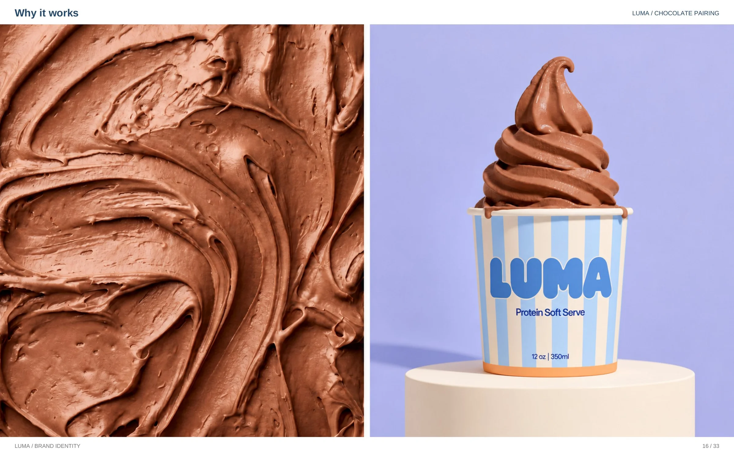
Protein desserts usually dress like diet products — restrained, clinical, apologetic — so Luma is built the other way around: indulgence first, with the protein as the bonus, around one soft, rounded wordmark and a palette taken from the product itself. The full presentation follows, the way it was designed to be scrolled. A written walkthrough of the thinking is on the blog at /blog/luma-brand-identity.
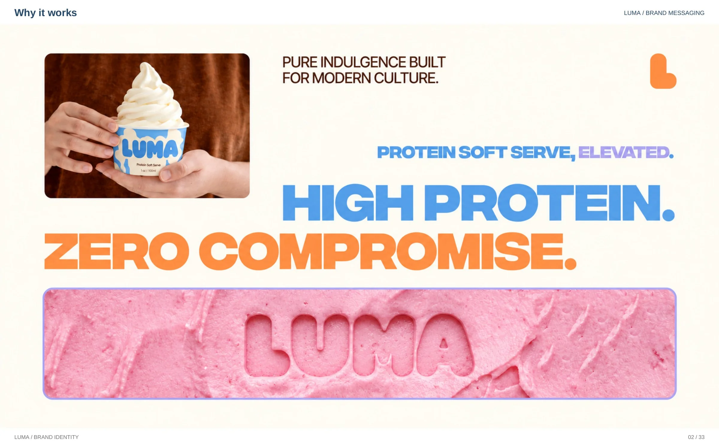
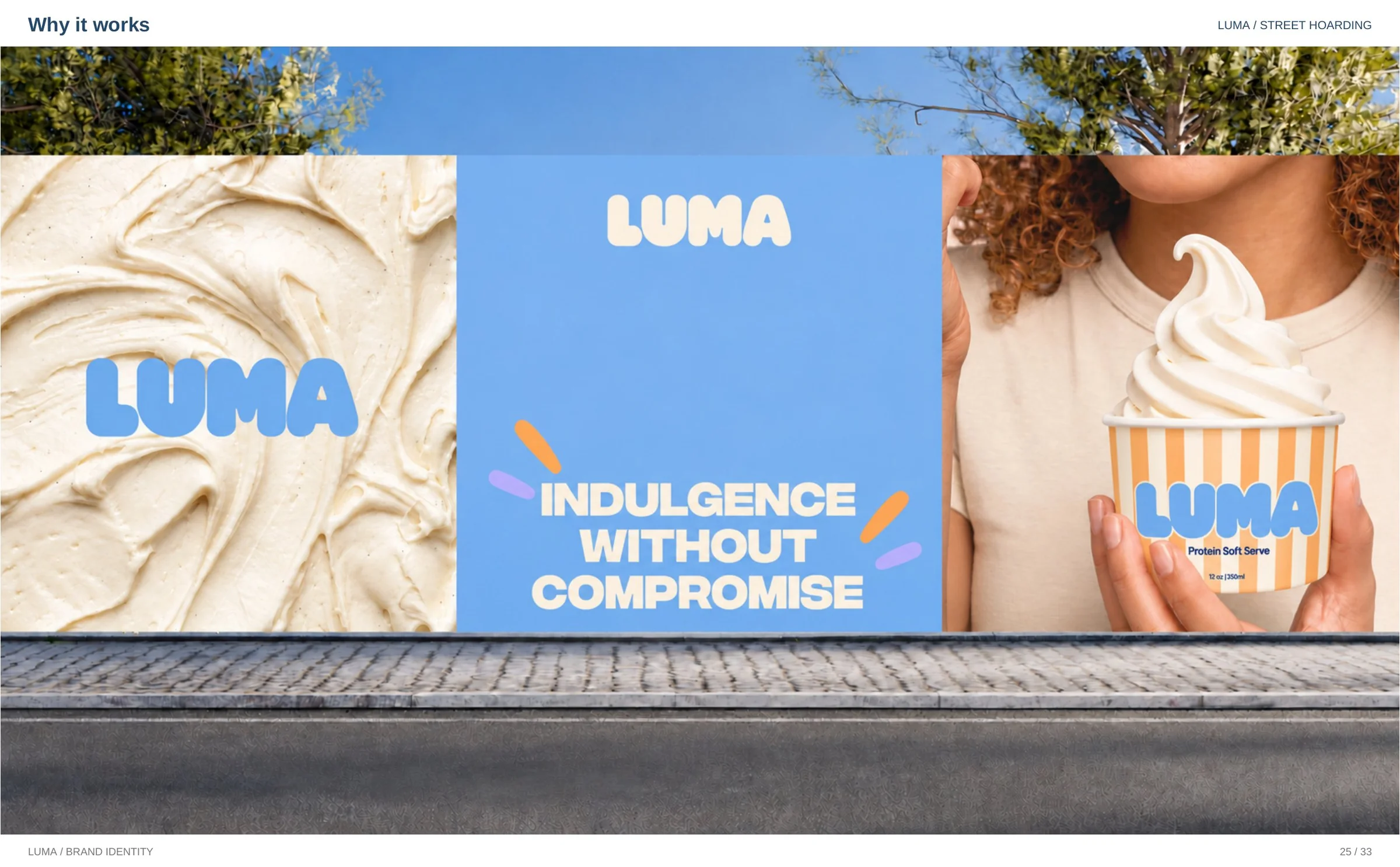
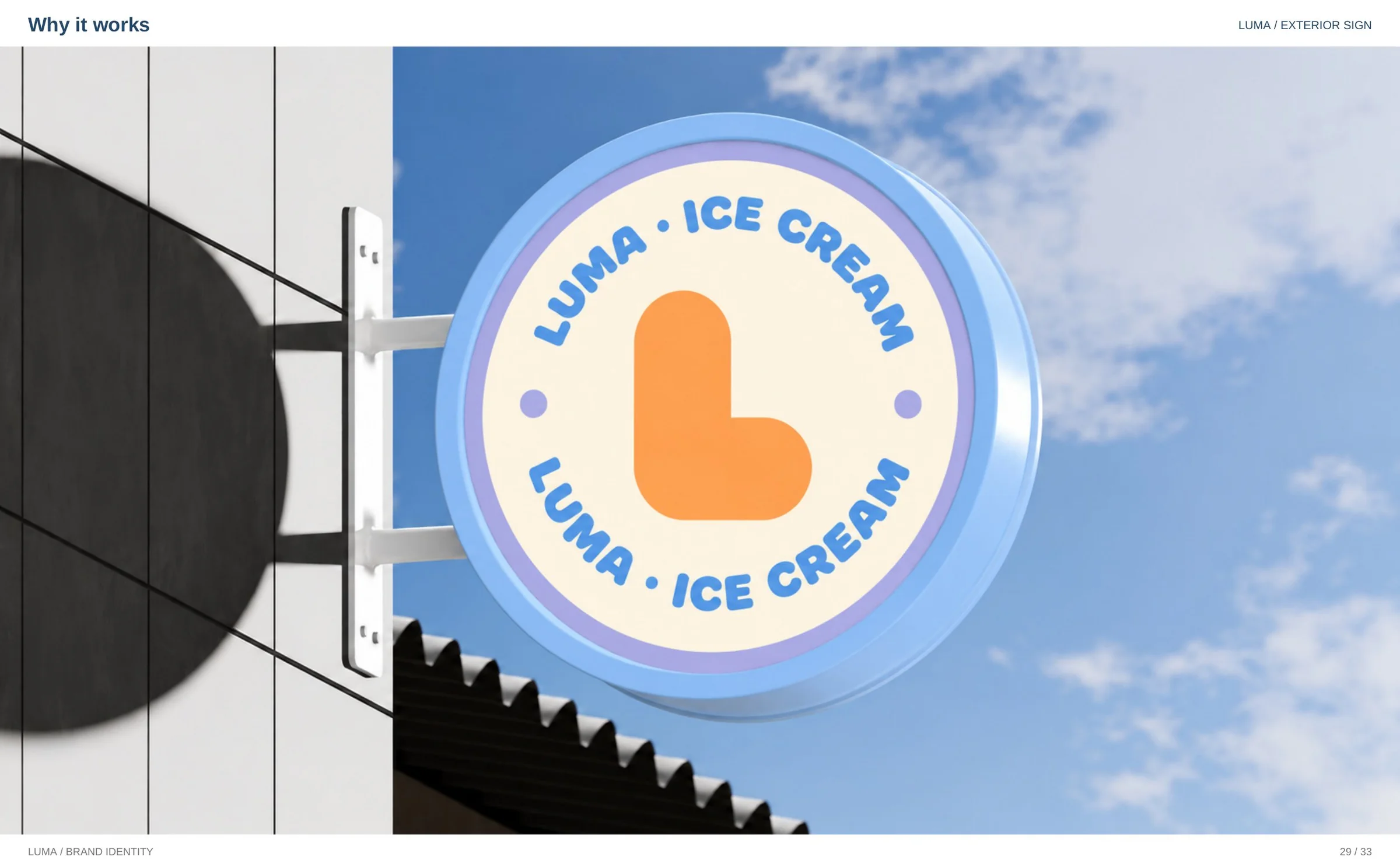
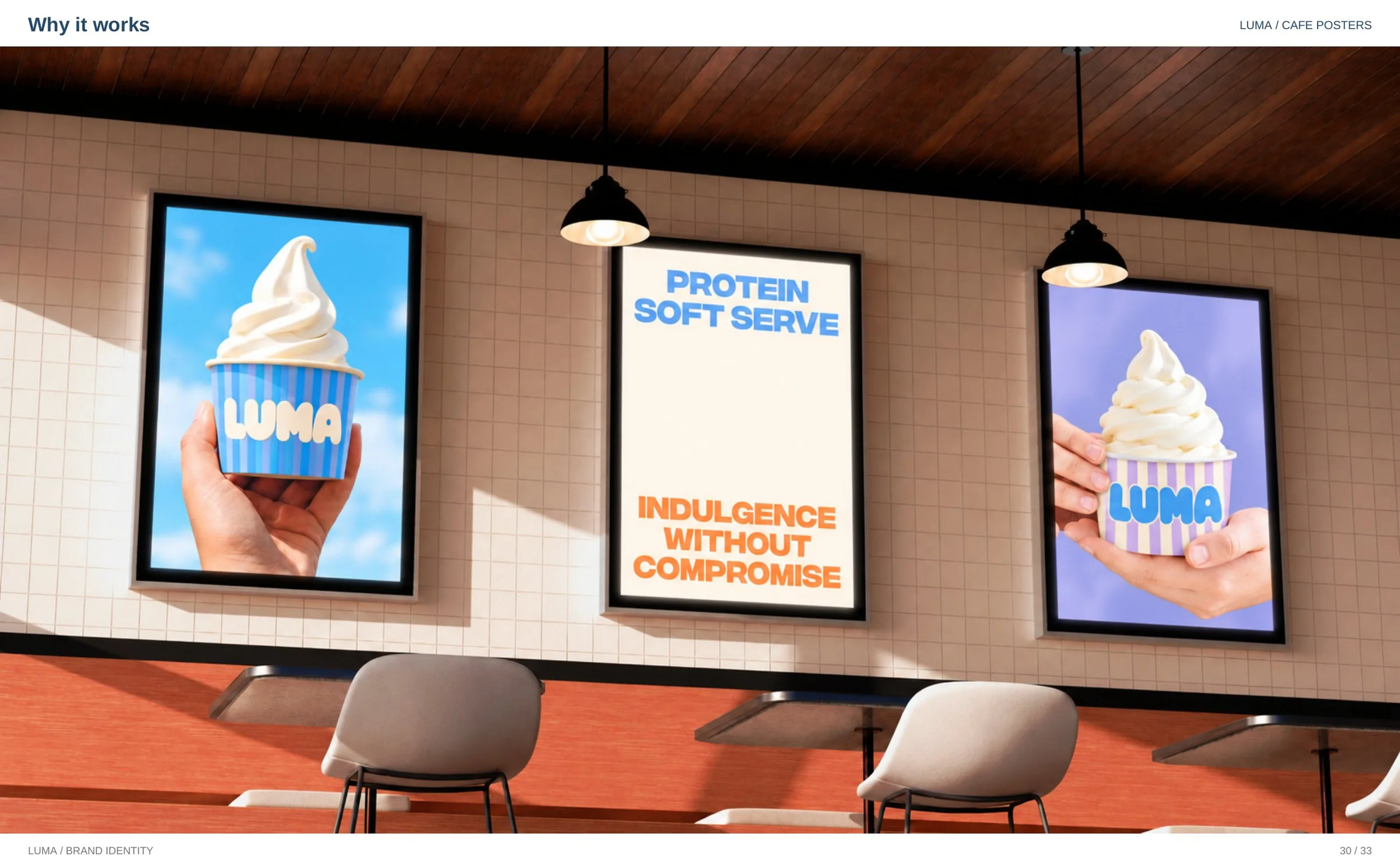
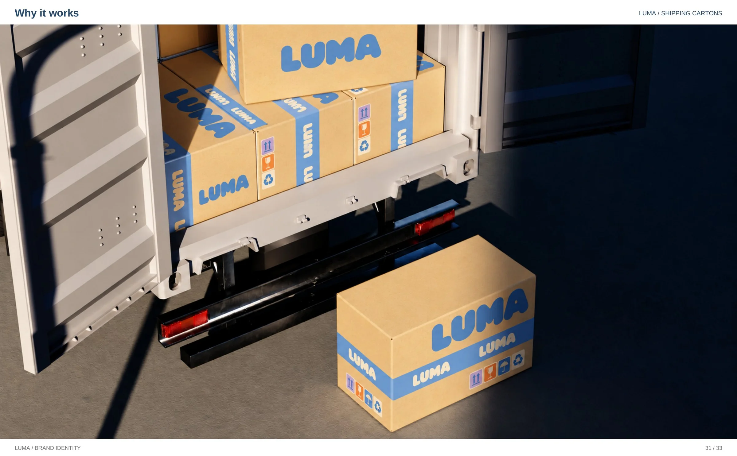
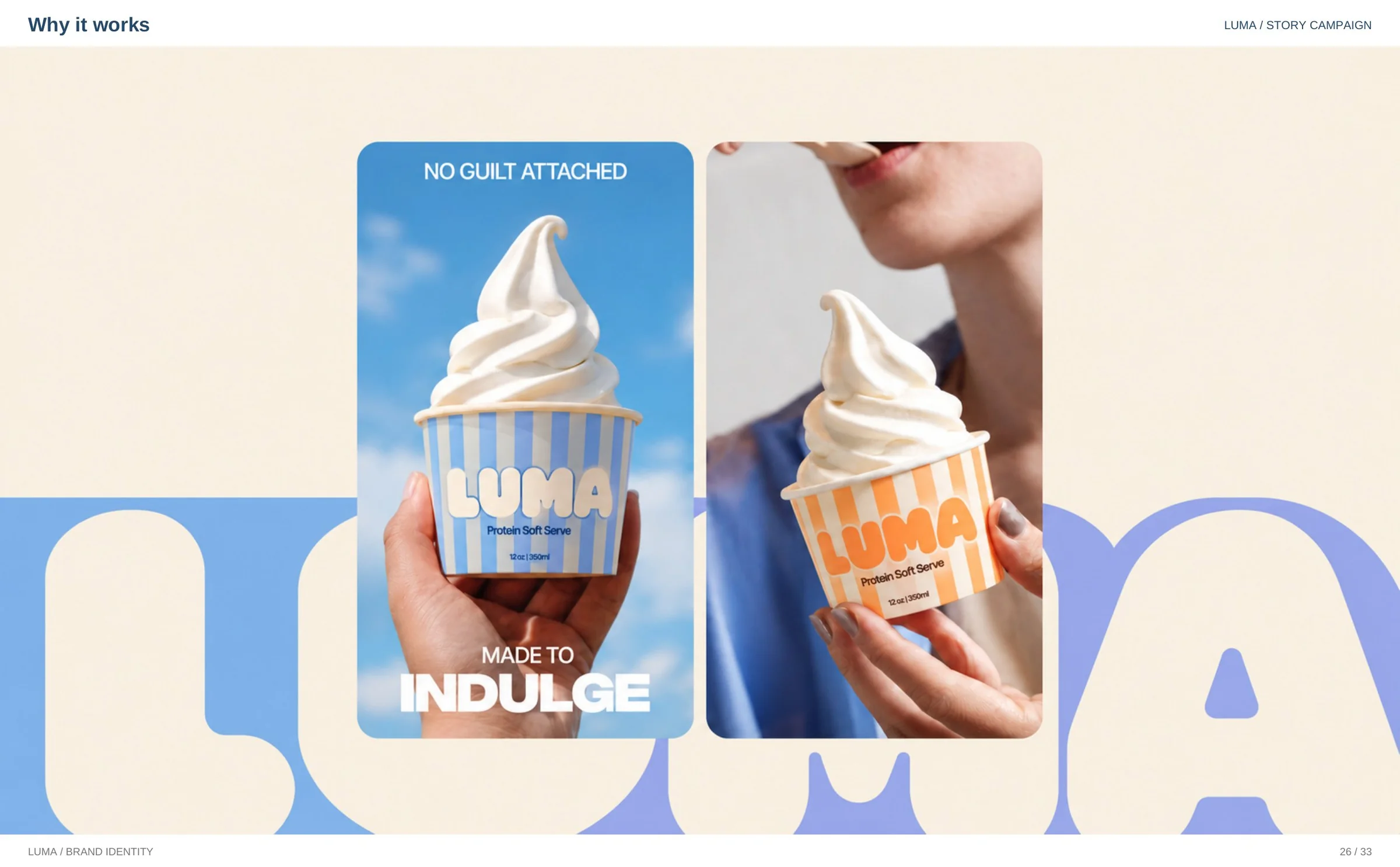
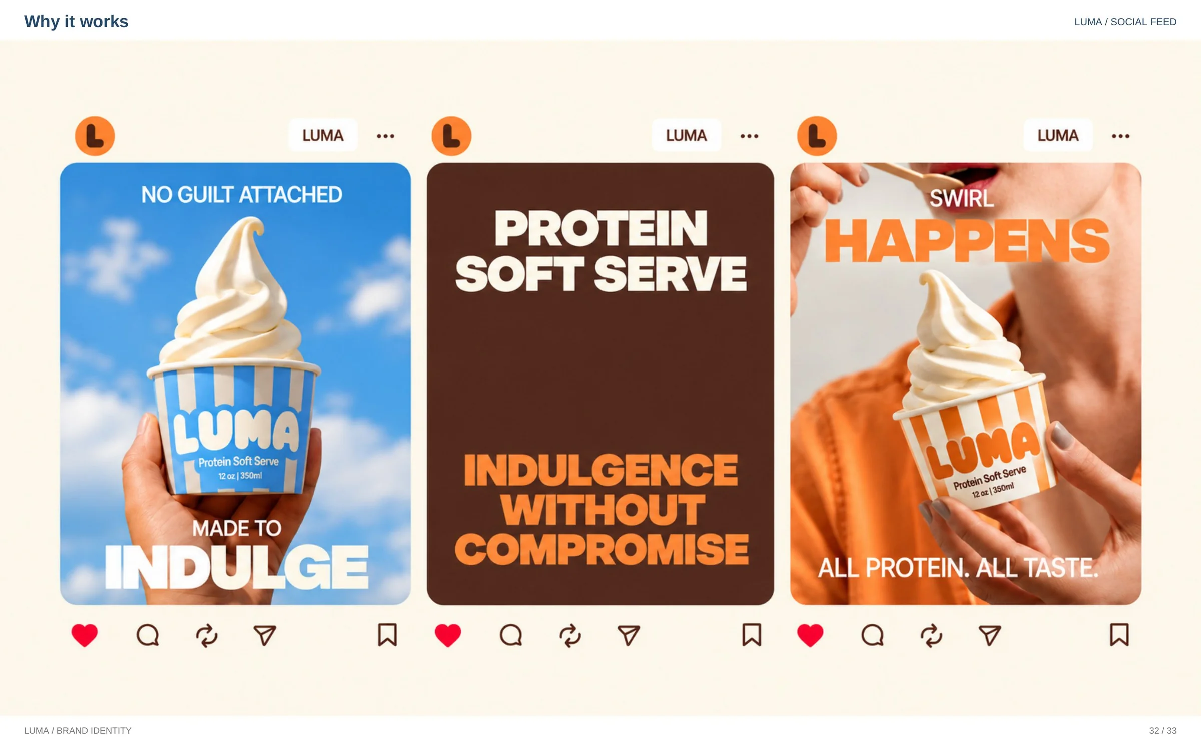
Indulgence without compromise.
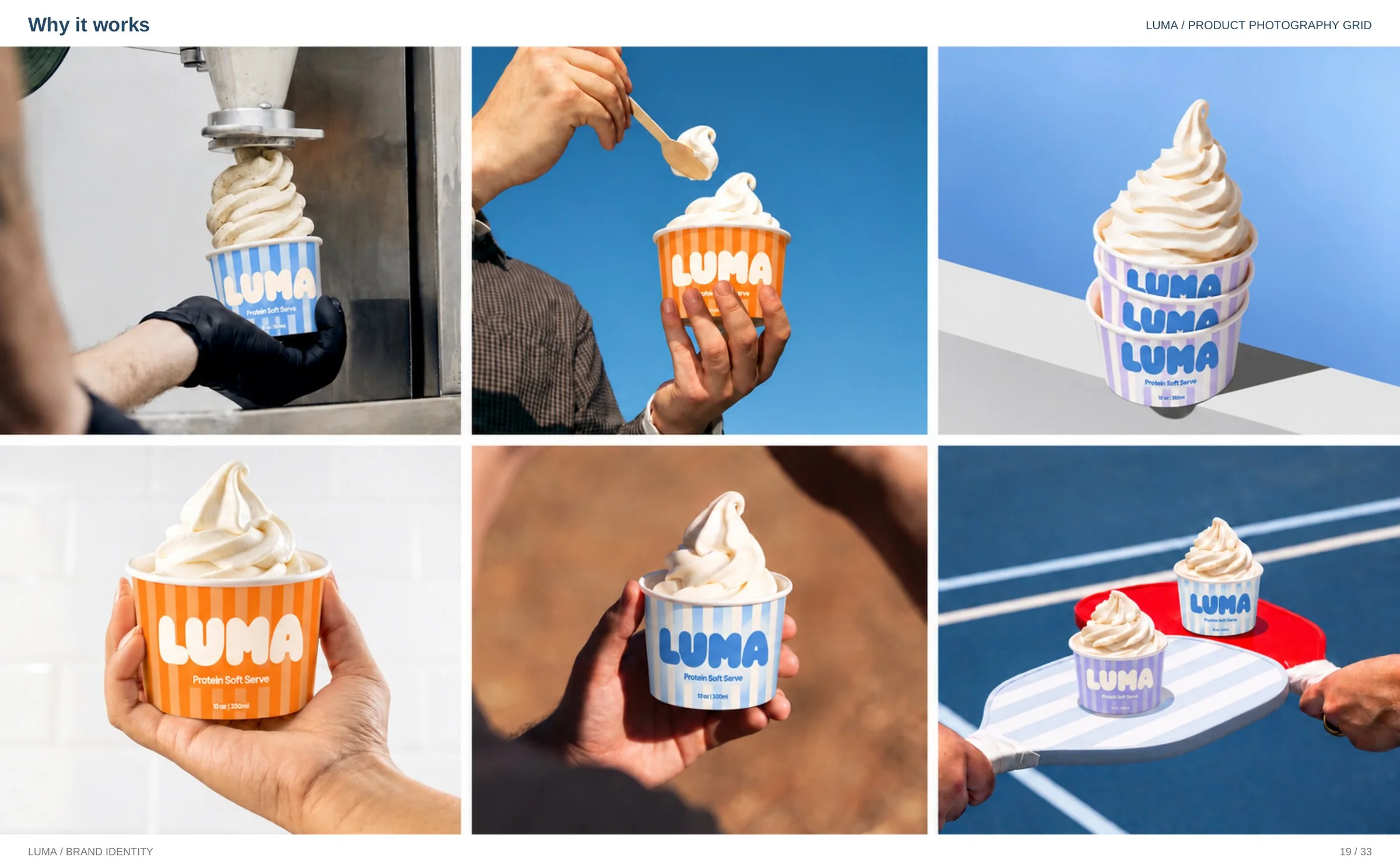
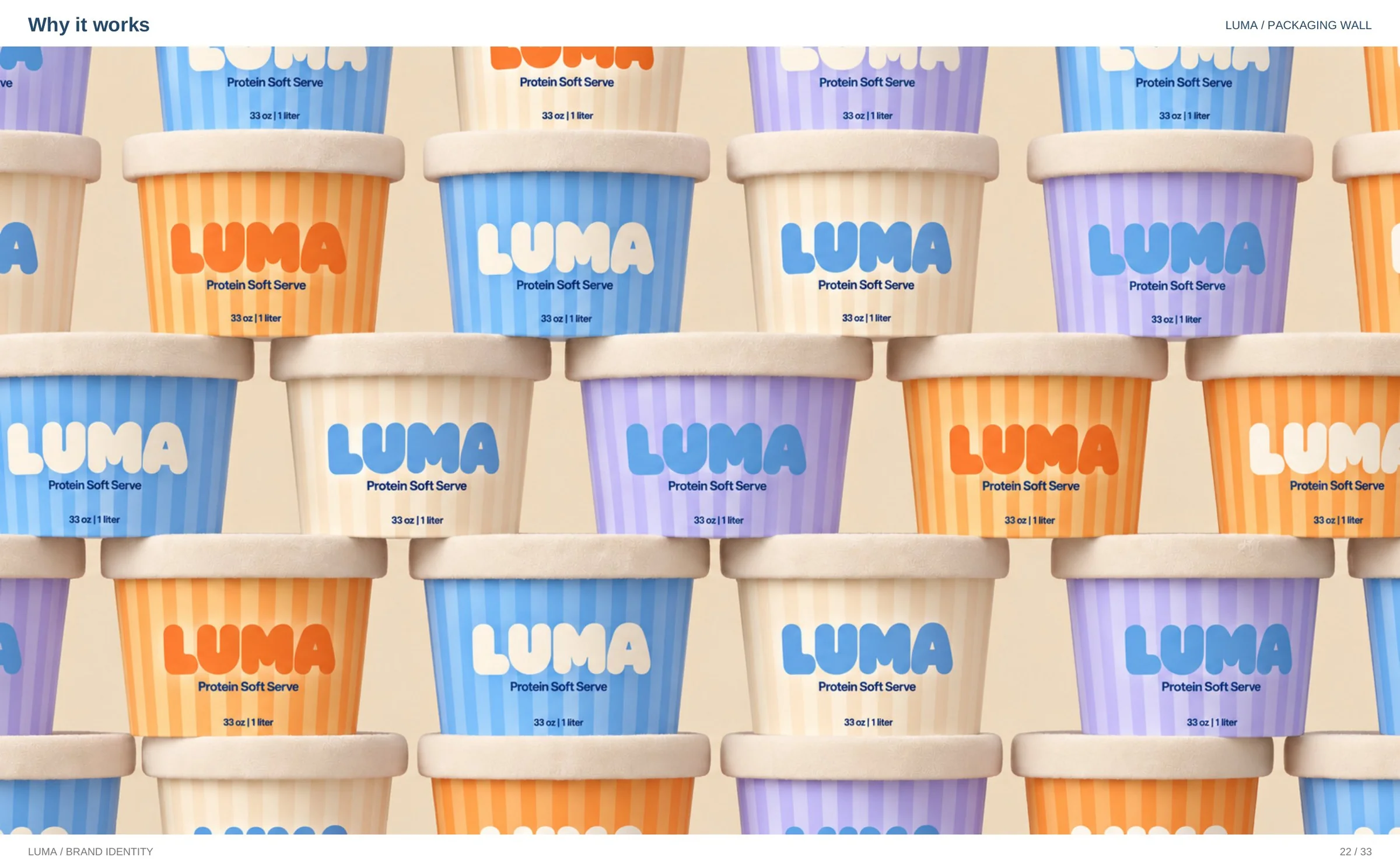
One identity system across cups, pints, signage, café walls and the feed — designed by whyitworks. Building a food or DTC brand that needs the same treatment?


