

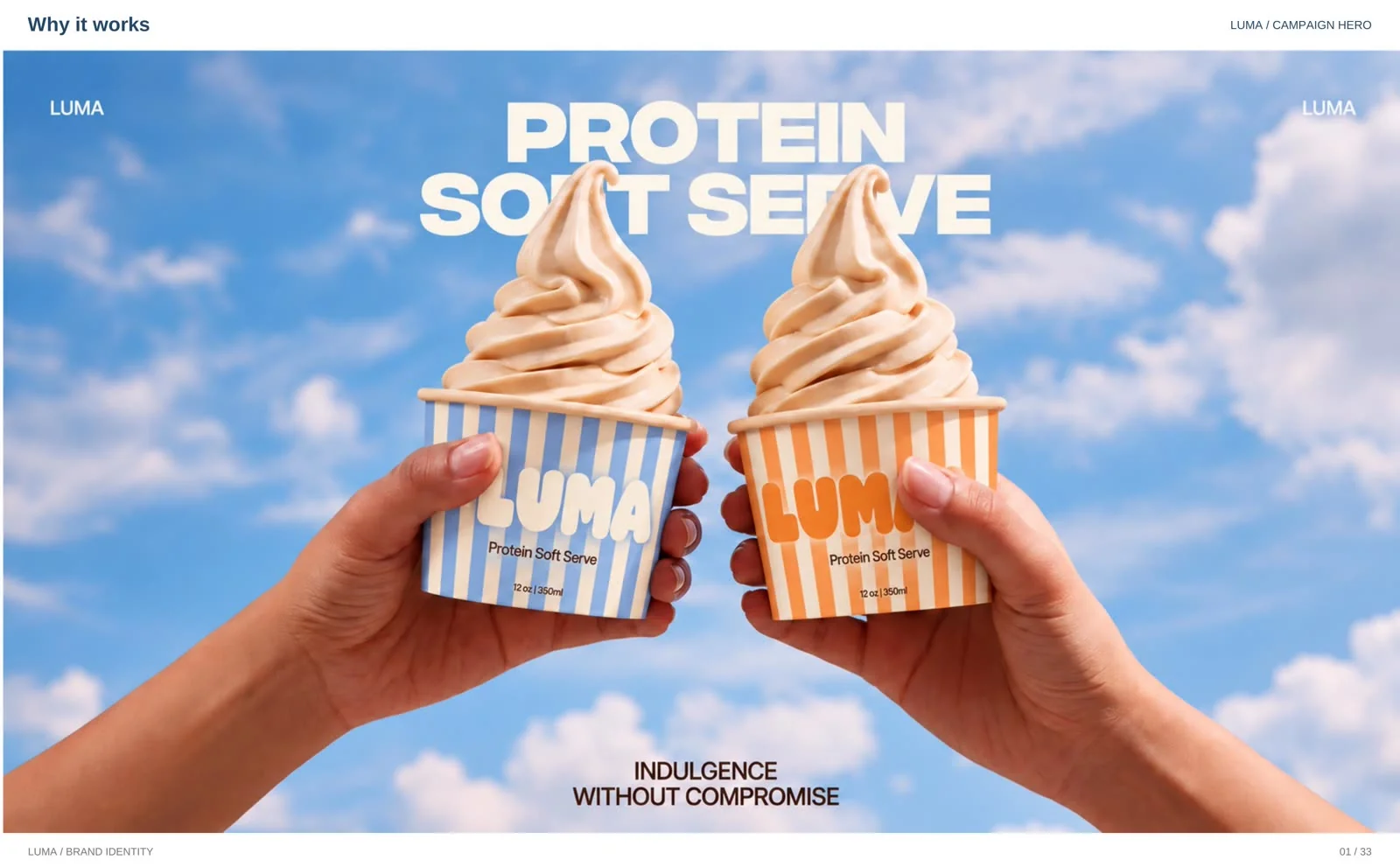
Most protein products apologise for existing. Luma does the opposite.
Luma is a protein soft serve brand, and this is the full identity built for it at whyitworks: logo, colour, typography, packaging, signage, and campaigns. This article walks through the thinking behind the work — why a high-protein dessert was deliberately designed to look like a treat first and a health product second, and what any food or DTC founder can take from that choice.
The same honest note as my Shopify conversion guide: this is a design case study, not a results claim. There are no sales numbers attached to it, and I would rather show you the work and the reasoning than invent outcomes. The full gallery lives in the portfolio.
The problem: protein that looks like a punishment
Walk past the protein aisle and the design language barely changes: white space, thin type, clinical blues and greens, and the words “guilt-free” set small, as if the product is asking permission. The intention is to signal health. The effect is to signal compromise — before anyone tastes anything, the packaging has already told them it will not be as good as the real thing.
Soft serve is the opposite purchase. Nobody buys a swirl of ice cream as a health decision; they buy it because it looks like a good moment. A protein soft serve brand therefore has a design problem most protein brands never face: it has to win the appetite decision first, in about a second, against every regular ice cream brand on the street — and only then get credit for the protein.
So the brief I set for Luma was simple: build the brand a treat would wear, and let the copy carry the protein.
The idea: indulgence without compromise
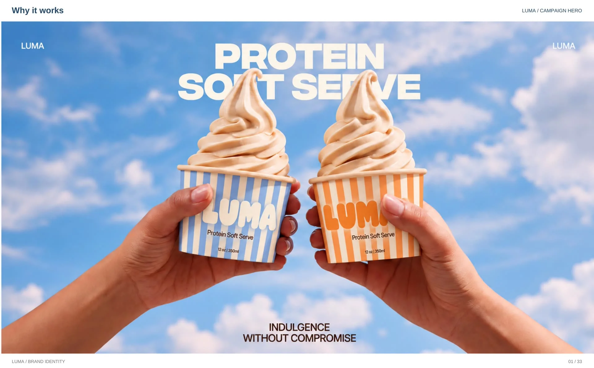
Every identity needs one line it can repeat until the line becomes the brand. Luma’s is Indulgence Without Compromise. It sits under a short messaging stack — “Protein Soft Serve, Elevated” and “High Protein. Zero Compromise.” — with one supporting line for the brand story: “Pure indulgence built for modern culture.”
That stack does real work. It names the product, makes the promise, and refuses the apology — in nine words a customer can hold. And because it is short, it survives everywhere the brand has to speak: the cup, the café wall, the billboard, the Instagram caption. A positioning line that only fits in a brand deck is not a positioning line.
A logo with soft-serve curves
The LUMA wordmark is drawn the way the product feels: chunky, rounded letterforms with the softness of a swirl, friendly at a glance and unmistakable at a distance. It works flat in Sky Blue, reversed out of colour, and as a sculptural, cream-textured 3D version for campaign moments — the letters themselves become the dessert.
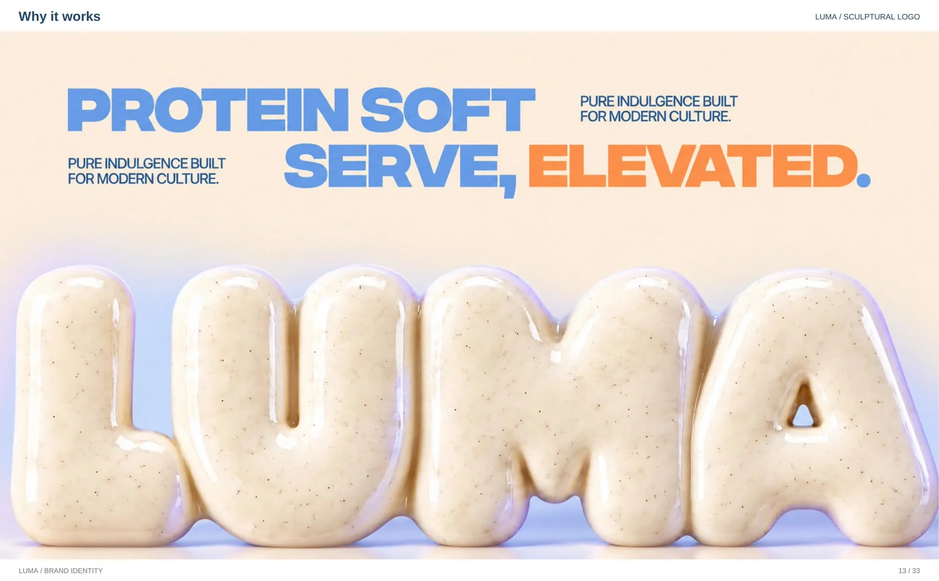
Then comes the unglamorous part that turns a logo into a system: the construction grid behind the letterforms, a defined clear space that must surround the mark, and six written misuse rules — no unauthorised colours, no tilting, no added effects, no changing individual letter colours, no altered proportions, no strokes. None of that is decoration. It is what keeps Luma the same brand when a printer, a sign maker, or a new team member handles the files.
Colour taken from the product itself
The palette was not picked from a trend board; it was scooped from the product. Five colours, each with an assigned job: Sky Blue (#8CB9E7) leads as the primary, Vanilla White (#F8EBD8) is the base, Orange Cream (#FD9D4C) and Lavender Mist (#9FAEE5) are the accents that add variety, and Choco Brown (#54322B) provides the contrast that keeps the pastels grounded.
The flavours themselves became brand assets: full-bleed texture photography of strawberry, chocolate, vanilla, cookies and cream, and matcha swirls, paired with each flavour’s cup. And the stripes on the cup — the oldest ice cream parlour cue there is — run through the packaging, the patterns, and the campaigns. Cover the logo and the brand is still recognisable. That is the test a colour system has to pass.
Typography: bold words, soft character
The type system is deliberately quiet: Helvetica, in bold and bold oblique for headlines, with the full family specified for supporting text. The deck’s own summary is the rule — bold words, soft character. The wordmark carries the personality; the typography carries the information. When every element of an identity tries to be the character, the result is noise. Luma shouts with its logo and its photography, and speaks plainly with its type.
Packaging first, because the cup is the media
For a soft serve brand, the highest-reach advertising surface is not a billboard. It is the cup in a customer’s hand, in their photo, on their story. So packaging was designed as media: striped 12 oz cups in rotating colourways that stack into a wall of brand colour, and 33 oz take-home pints with the same system, so the brand survives the trip from the counter to the freezer at home.
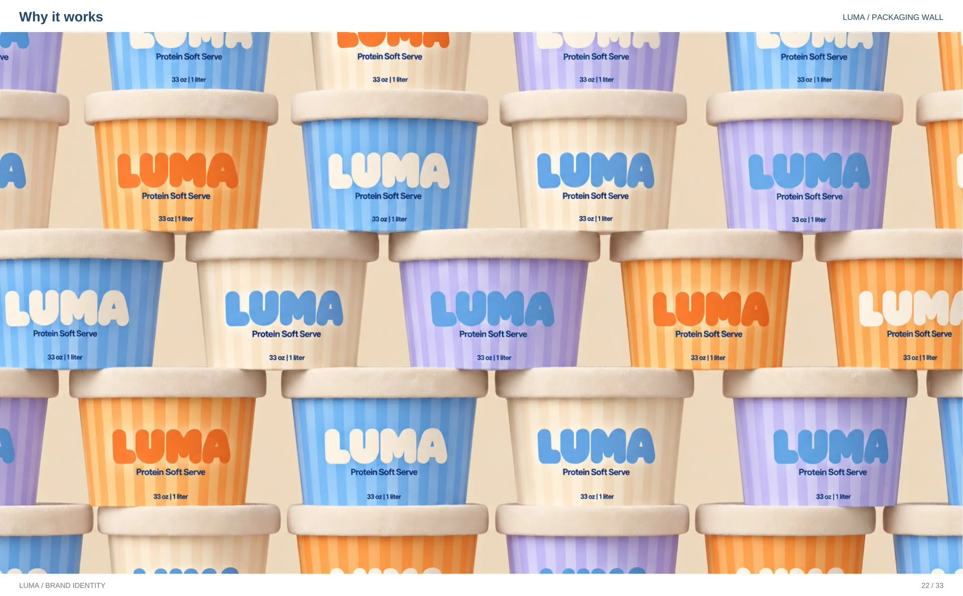
Each launch flavour — vanilla, strawberry, chocolate — gets a pairing: the cup against its own texture, so the flavour is recognisable before a word is read. That pairing system is what lets a new flavour launch later without a redesign; the system already knows what a Luma flavour looks like.
One brand, every surface
The identity was then carried across everything a customer can meet: the outdoor billboard and street hoarding (“Pure Soft Serve. Zero Compromise.”), café posters on the wall, a circular exterior blade sign built around the L icon, staff aprons and a branded cap, taped delivery cartons in the back of the truck, and a social system — profile, story templates, and feed posts — that keeps the same lines, stripes, and swirls in the feed.
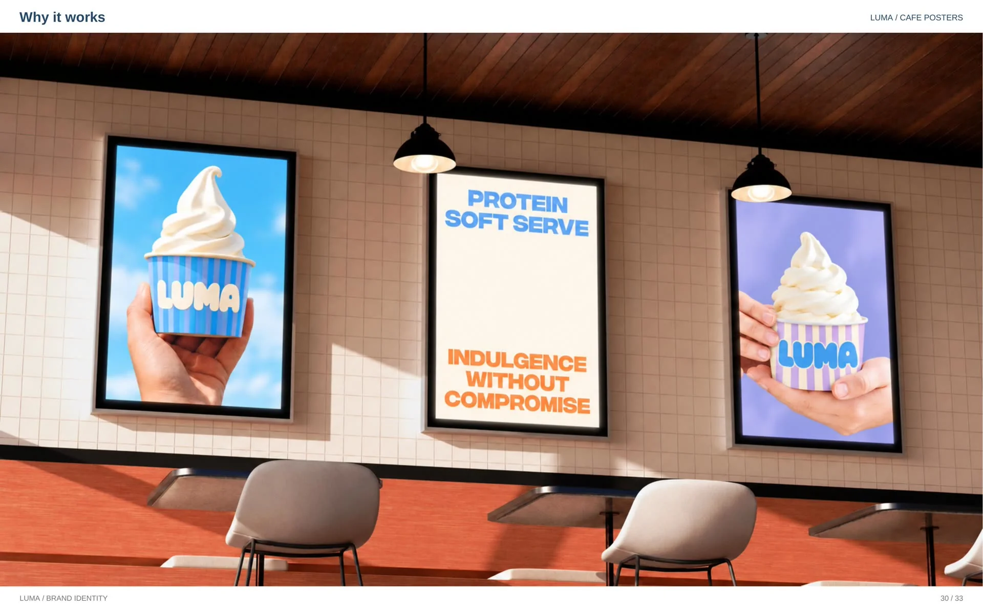
None of these surfaces were designed one by one. They were all generated from the same kit: wordmark, palette, stripes, textures, type, and the one repeated line. That is the difference between a logo and an identity — the identity is what makes the tenth touchpoint as recognisable as the first.
What founders can take from Luma
1. Sell the treat, carry the benefit in the copy. If your product is a pleasure purchase, design for the pleasure and let words handle the functional claim. Design that apologises sells the compromise, not the product.
2. Let the product design the palette. Colours pulled from the product itself — flavours, textures, the world it is eaten in — come with recognition built in, and they age better than trend colours.
3. Write the rules while the brand is still yours alone. Construction, clear space, and a short list of don’ts take a day at identity stage and save the brand every time someone new touches it.
4. Repeat one line until it becomes the brand. Indulgence Without Compromise appears on the hero, the hoarding, the café wall, and the feed — unchanged. Recognition is repetition, and repetition is a design decision.
Questions founders ask about brand identity
Should a healthy product look healthy?
Not necessarily — it should look like what it promises. Luma promises a treat, so the brand wears treat colours, treat typography, and treat photography; the protein is carried in the copy, not in a clinical design language. When a better-for-you product dresses like medicine, shoppers expect a compromise on taste before they have taken a single bite.
What does a full brand identity include?
For Luma it meant the whole system, not just a logo: the primary wordmark with construction, clear-space, and misuse rules, a five-colour system with assigned roles, a typography system, packaging for cups and take-home pints, staff uniforms, exterior signage, café posters, outdoor and street campaigns, delivery cartons, and social templates. A logo is one asset; an identity is everything staying recognisably the same brand.
Why do small brands need logo rules and clear space?
Because the moment a brand leaves your laptop, other people handle it — printers, sign makers, shop staff, marketplace designers, the friend who makes the Instagram posts. Rules written once, while the brand is still yours alone, are what keep the logo the same logo on every one of those surfaces.
How do you choose colours for a food brand?
Start from the product, not from taste in colours. Luma’s palette is its flavours and its sky: Sky Blue and Vanilla White lead, Orange Cream and Lavender Mist add variety, Choco Brown gives contrast. Give every colour a job, then test the set on real packaging at real distance. If the palette still reads as the brand with the logo covered, it is doing brand work.
Who designed the Luma identity?
Luma was designed by whyitworks, Saif Ali’s ecommerce marketing agency — the same studio behind the Habibi fast food identity in the portfolio. If you are building a food or DTC brand and want an identity designed as a system rather than a single logo, the starting point is a fit call.
Saif Ali is an ecommerce growth consultant for DTC brands, doing full-journey CRO across Meta ads, landing pages and Shopify.
Building a brand that has to sell on sight?
If you are launching a food or DTC brand — or your current one looks like a compromise next to the product inside — I can build the identity as a system, the way Luma and Habibi were built: logo, colour, packaging, and the rules that keep them consistent. Start with a fit call, or take the free audit and I will tell you honestly where your brand is leaking recognition.
Prefer email? info@saifali.site


